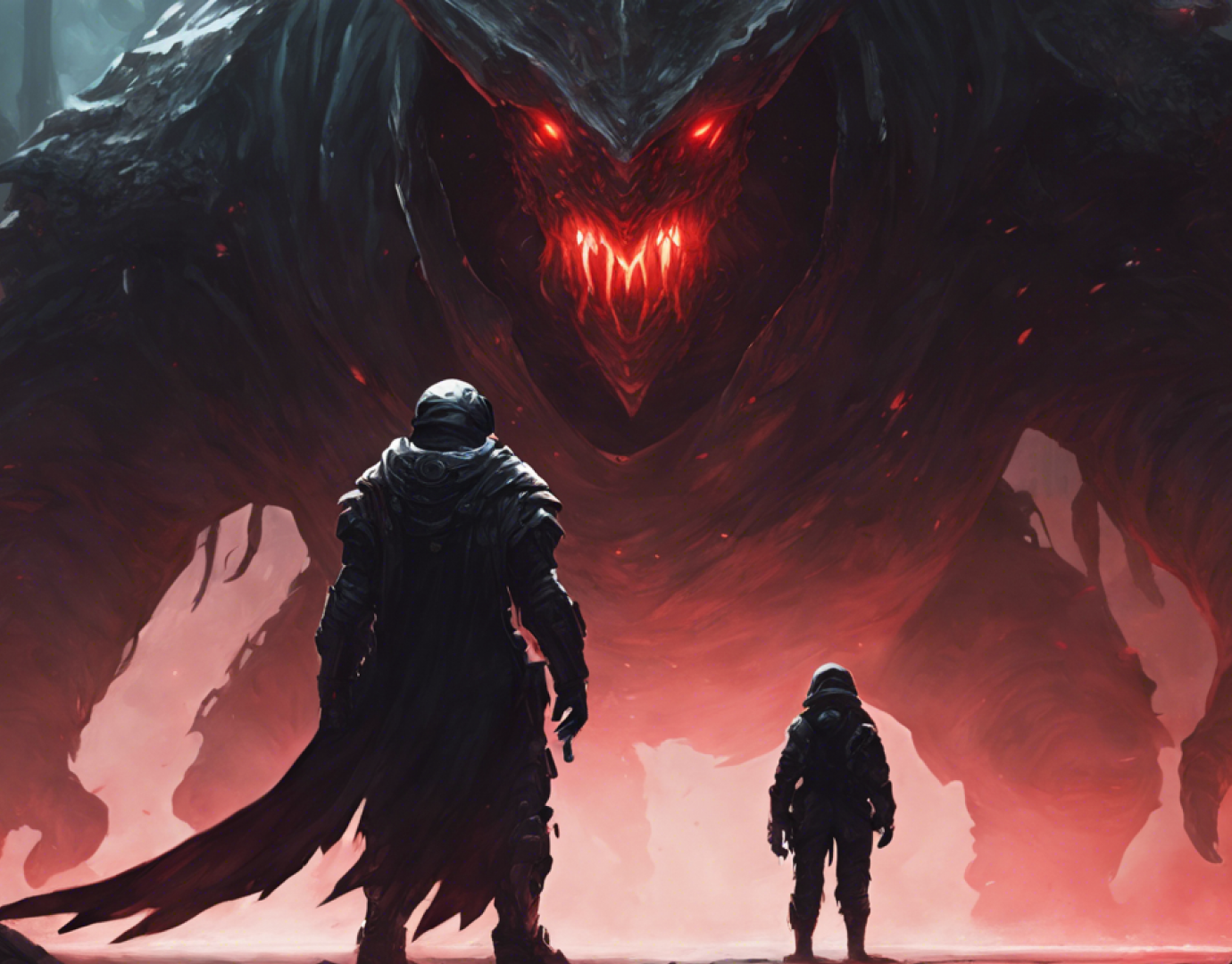
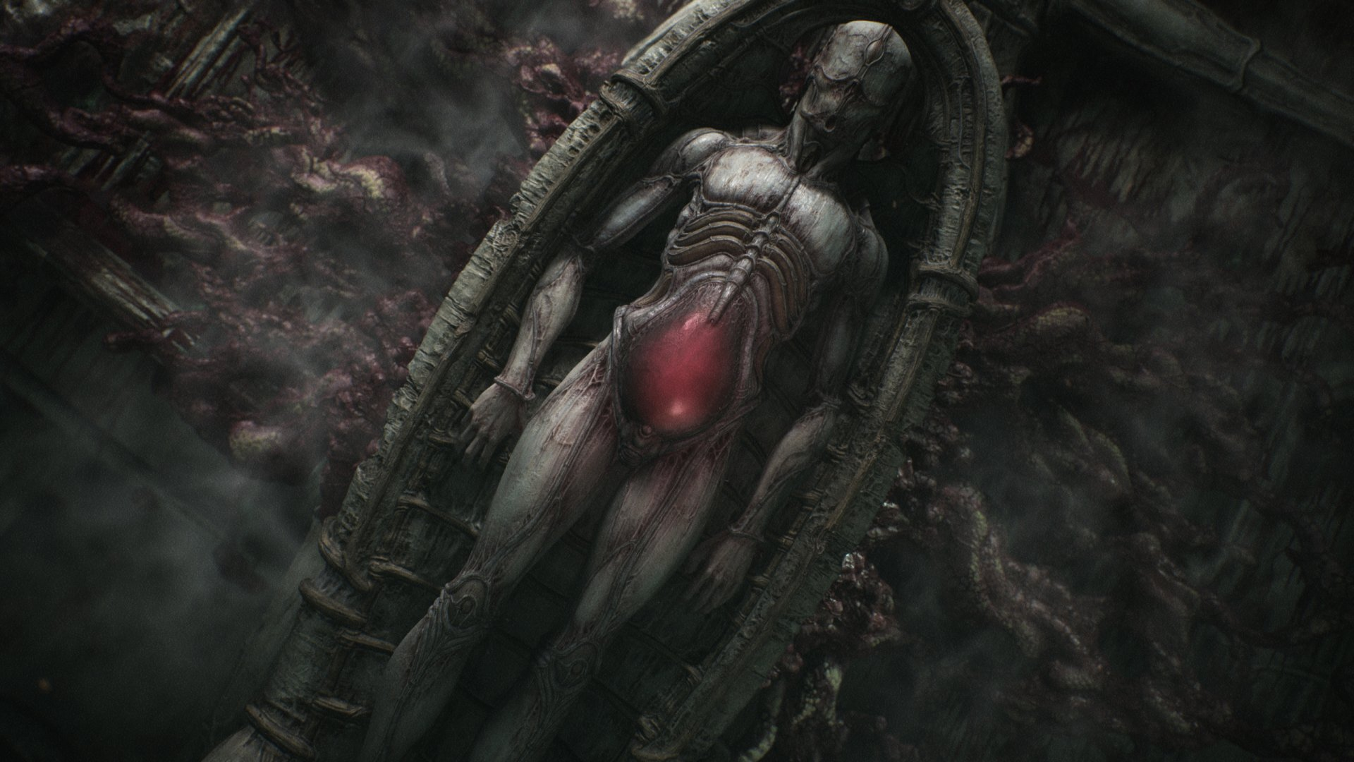
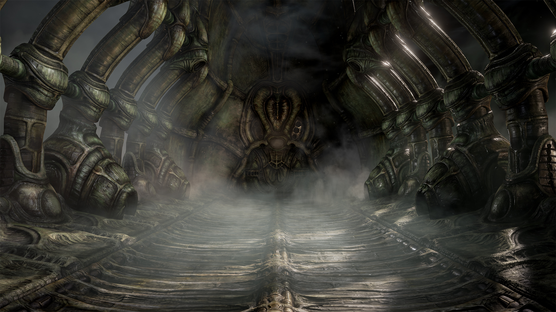
Scorn is a survival horror game released in 2022. What set it apart from other games of its genre was the biopunk-styled art direction inspired by the works of H.R. Giger. However, when the game made it into the hands of the public, the consensus was that while the aesthetics and puzzle-solving were amazing, a lot of players lamented its game length and its unbalanced combat.
This is an attempt to examine the gameplay and see if it can be re-imagined into a more cohesive experience
CLIENT: Personal Project
ROLE: Ux, Game Designer
TEAM: Solo contributor
TIMELINE: 1 Week

The developers of Scorn stated that they wanted the player to be “thrown into the world” rather than have expositional and contextual information presented to them. As such, there is very little to indicate the setting or premise of the game overall in the way of exposition or its user interface.
Pain Points
- The combat is unbalanced
- The save system is limited and can work against the player
- The game breaks its immersion by not clearly defining its identity

Competitive Analysis
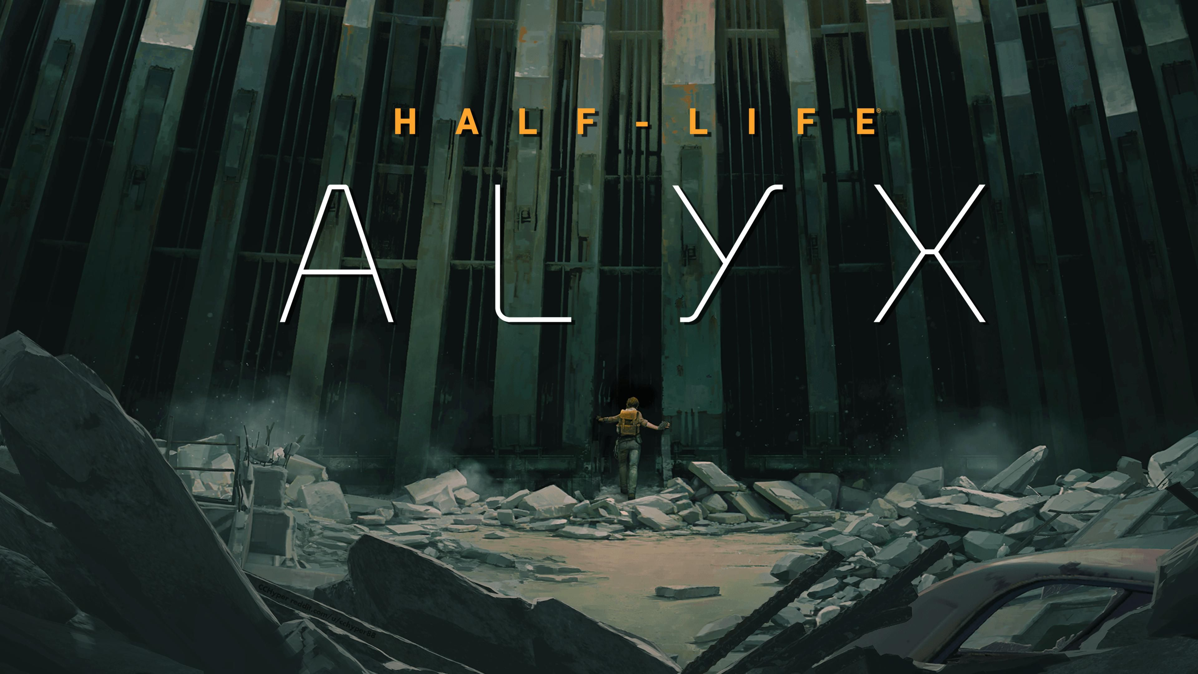
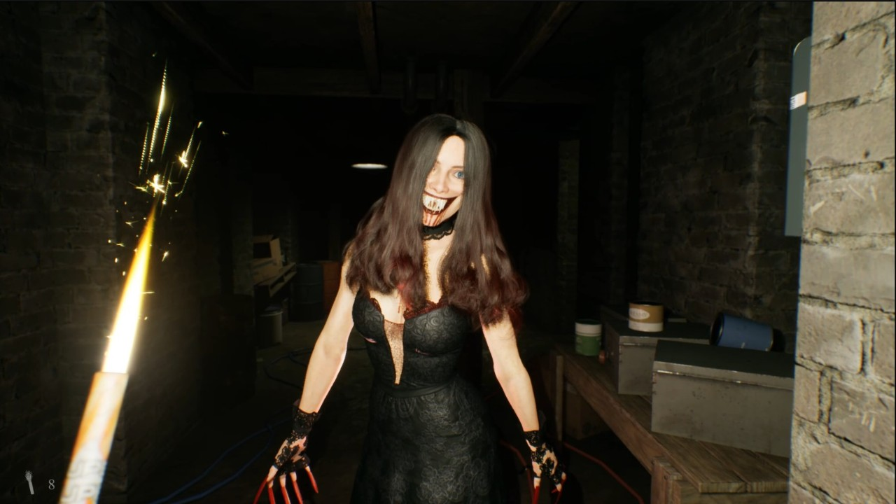
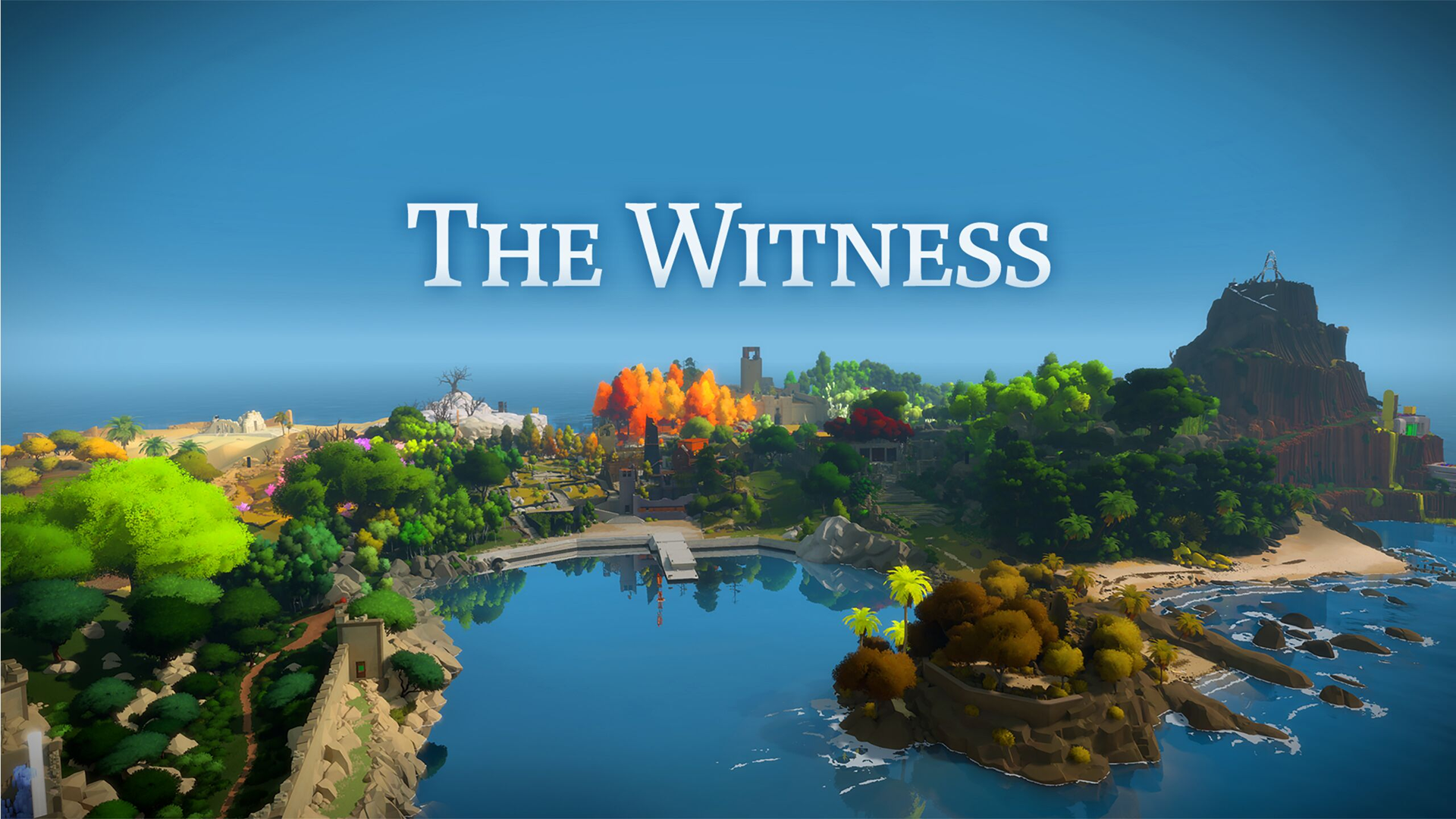
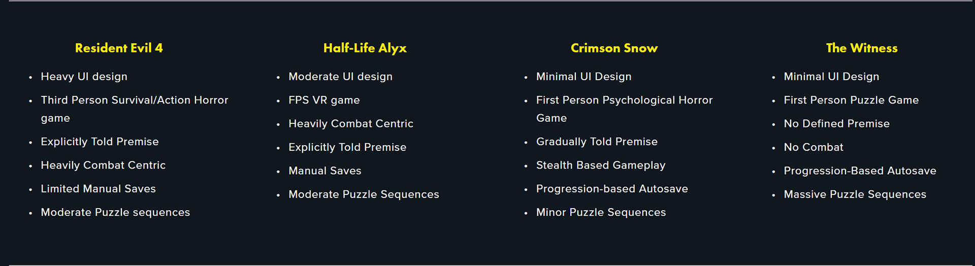
The comparison came between four games: Resident Evil 4, Half-Life: Alyx, Crimson Snow, and The Witness. Each game shares common themes and game mechanics but differs in several ways. When it comes to horror, Scorn is more in line with Crimson Snow and Resident Evil. However, in terms of its puzzles and exploration, it shares more in common with The Witness and Half-Life: Alyx.
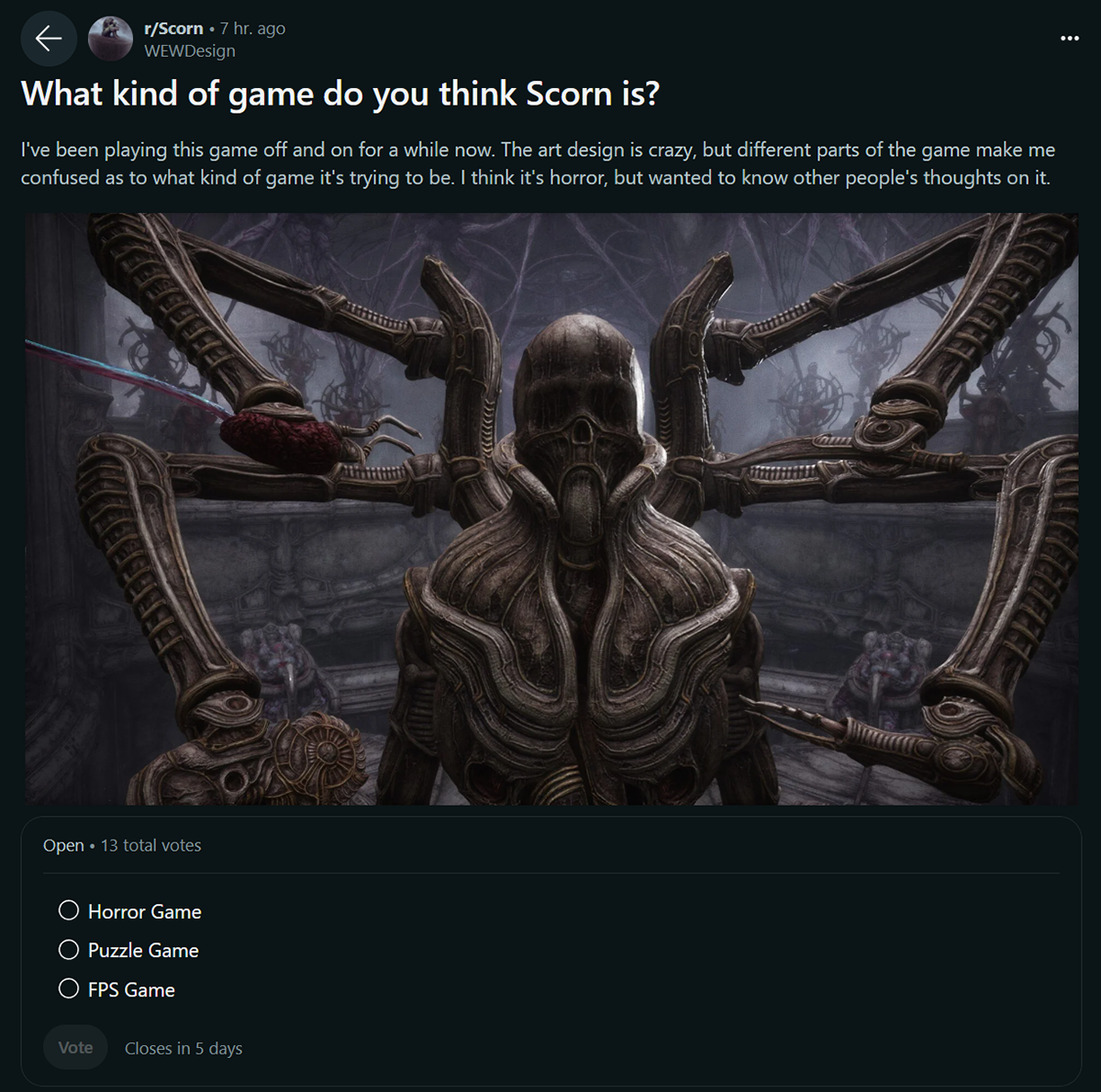
Community Poll
To get the purest perspective on determining what Scorn’s identity is, I posted a simple poll on the Scorn subreddit. Appearing as another player, I posed the question of what kind of game everyone thought Scorn was: A Horror Game, a Puzzle Game, or an FPS Game. I kept the number of choices small to better define its themes and genre.
My conclusion from these lines up with a lot of the reviews and criticisms from critics and gamers: the combat mechanic is an unnecessary aspect of the game that harms the experience, and would likely be better served if it were polished more or axed from the game altogether.
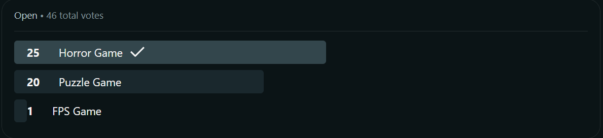

The community polls show that many different people have different perceptions of Scorn's game experience, and it's to its detriment. So, focusing on that, finding the right combinations of aspects to its gameplay to enhance that experience will be key. In doing so, we'll choose between Game Type, Save mechanics, and Combat Mechanics
Game Type
Free Roam Mode
From the research, the visuals are the main appeal of the game overall. What I propose is a dedicated mode where players can roam the environment free of enemies or puzzle requirements. A mode like this isn’t entirely unheard of, as Assassin’s Creed: Odyssey and Origins do the same thing. For a game with art direction like this and its inspirational origins, I’m sure there could be tons of developer commentary that could be input through the environments for players to interact with.
Puzzles only
Scorn’s progression is dependent on solving elaborate puzzles and should be the main focus of the game. The Witness from the competitive analysis accomplishes this without any combat peppered into it and still manages to maintain a cohesive experience.
Save Mechanics
Location-based Save Points
In the same vein as Resident Evil 4 from the competitive analysis, location-based manual saves present the most immersive way to save progress. Location-based saving is a common concept in horror games, but in Scorn, where the environment is the main draw, players interacting with it for reasons besides the puzzles could add to the immersion.
AutoSave on each puzzle
Autosaving when interacting with each Puzzle presents the least intrusive way to improve the save mechanics. Puzzles are a massive part of Scorn and are essential to progressing through the game. The Witness and Crimson Snow from the competitive analysis both utilize similar implementations.
Combat Mechanics
eliminate combat
The combat sections break the experience and make it unenjoyable for the player as-is. As stated by reviews, gamers, and people who participated in the community poll, very few people perceive Scorn as an FPS. Combat is far from the main focus of the game, overall hindering the grotesque atmosphere the game has cultivated thus far, and should be eliminated.
Tweak combat
If Scorn wants to lean into the survival horror aspect, then combat needs to be tweaked. The gaps in speed between enemy movement and player character movement are too wide to effectively enjoy combat. The Strafe button needs to be bumped up in speed so dodging is more effective. The enemy’s accuracy should be toned down just enough to give players a challenge while maintaining the survival experience.

The issues with Scorn stem from its lack of identity from a mechanical point of view, meshing different elements that, at times, can hamper the experience. The focal point of the game is the exploration and art design of its environment. To foster that experience, here’s what I’d propose from the ideations section: Puzzles Only, Auto-save on each puzzle, and Eliminating Combat.
Puzzles- Only
The puzzles are the means of interacting with the environment to the point that the progression hinges on completing them. They’re the key mechanic of the overall game, and introducing any other sort of elements alongside it does more to harm the experience.
AUTO-SAVING ON PUZZLES
If the puzzles are the central focus and the key to progression, then it’d make logical sense to complete them and be the trigger to autosave.
EXPLORATION, NOT FIGHTING
Combat feels unnecessary. It comes off as an added feature to change the pacing of the experience, but because of its unbalanced nature, it instead distracts from the atmosphere the game is conveying.

My main takeaway was that Game UX doesn’t always involve the visual. If anything, that was the least concerning aspect of this redesign. It taught me a lot about motion design within this context and how experiences can peak and fall due to how you plan progression. Motion played a large part in this game’s experience, and it was obvious why at many junctions it became disrupted.
I’ve worked on progression before for games, and knowing how to proceed through a story is a large part of my design process, but seeing it in this light makes me re-evaluate that not all game experiences need to be explicit in their context to the player. Sometimes it's something you have to find on your own, or be presented with something to form your ideas from. It’s something to take to heart moving forward.