See the updated visual gallery here >>>

Terminus is a Game UI/UX Concept inspired by looter-shooter games while integrating prominent RPG elements for a live-service model. This concept combines science fiction and cosmic horror in terms of aesthetic and narrative premise.
CLIENT: Independent Project
ROLE: UI/UX, Visual, Game Designer
TEAM: Solo Contributor
TIMELINE: six months

There’s a sense of detachment from the player character in a lot of looter-shooters since they’re usually cookie-cutter and one-dimensional. Ideally, I wanted to create an interface that encouraged aesthetic and game-wise customization. The general game concept is for a “Live service, RPG-heavy, looter-shooter game taking place in a Sci-Fi/Cosmic Horror setting,” which has to tackle several needs to facilitate the feature demands of those genres:

The concept for “Terminus” is that it’s a cosmic horror/science fiction game that operates as a live service with RPG elements and leveled loot. To differentiate from other live services that rely on Hero characters, the players will have a unique, customizable player character with a chosen class.
COMPETITIVE ANALYSIS
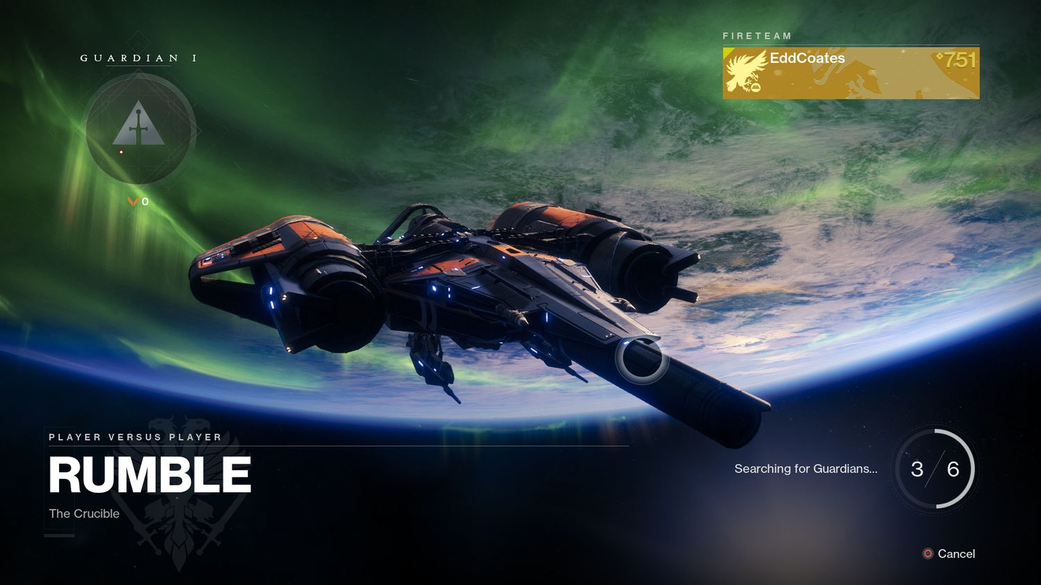
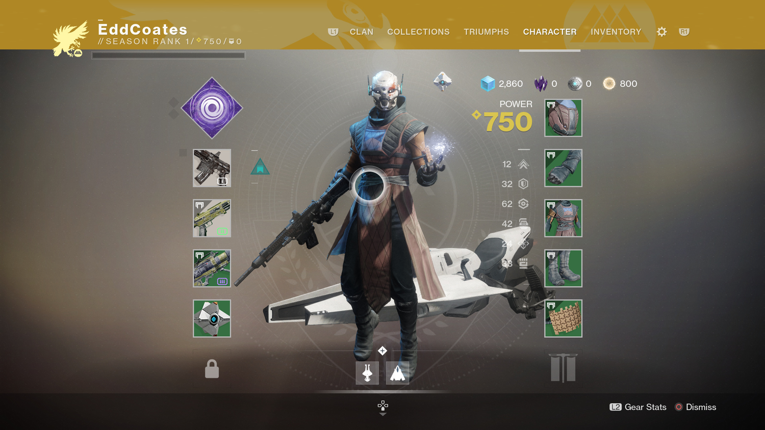
Destiny 2 is the definitive looter-shooter role-playing live service game. Since then, many games have adopted the icon-style-to-category design and cursor-based interface.
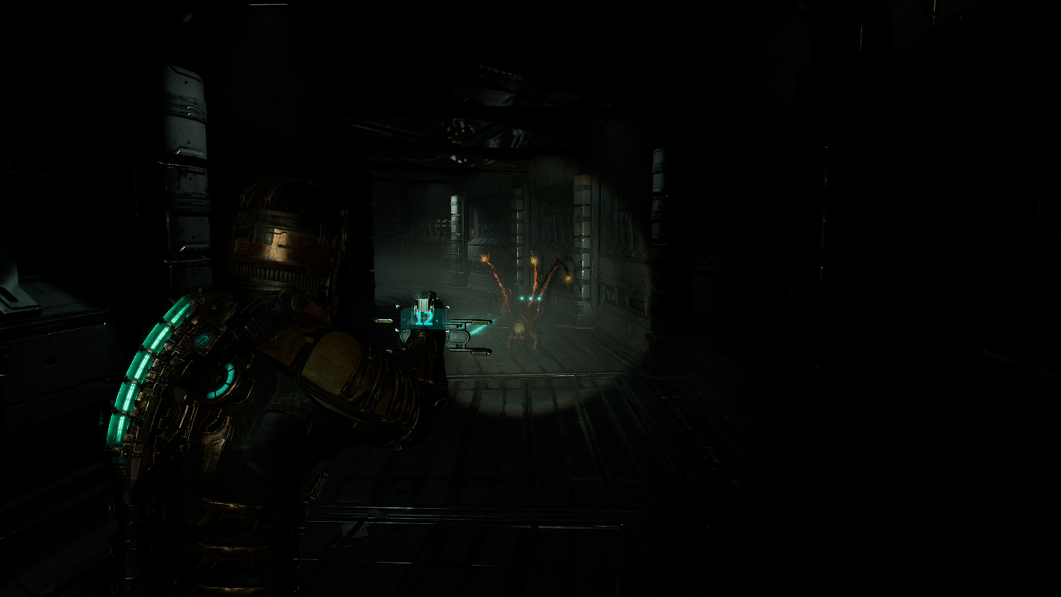
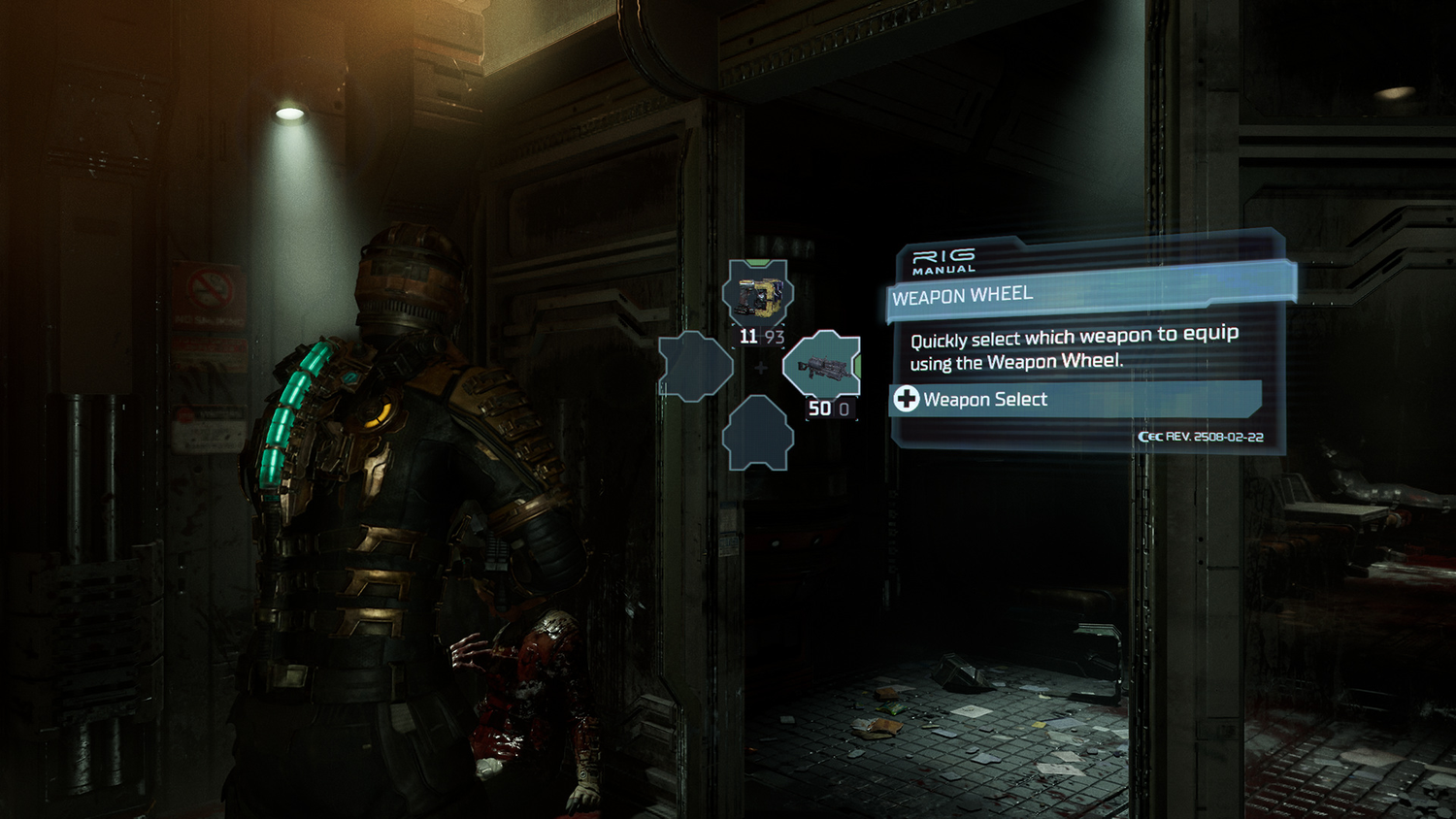
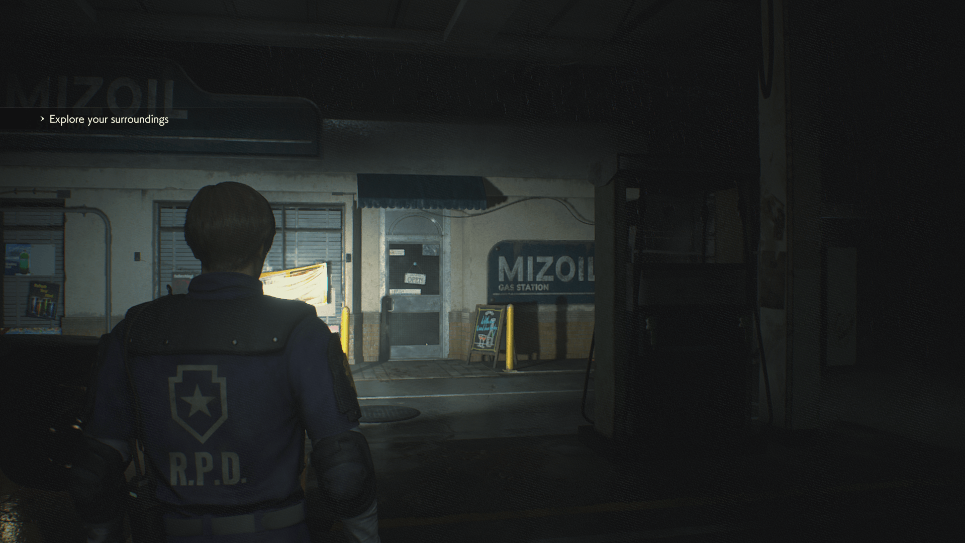
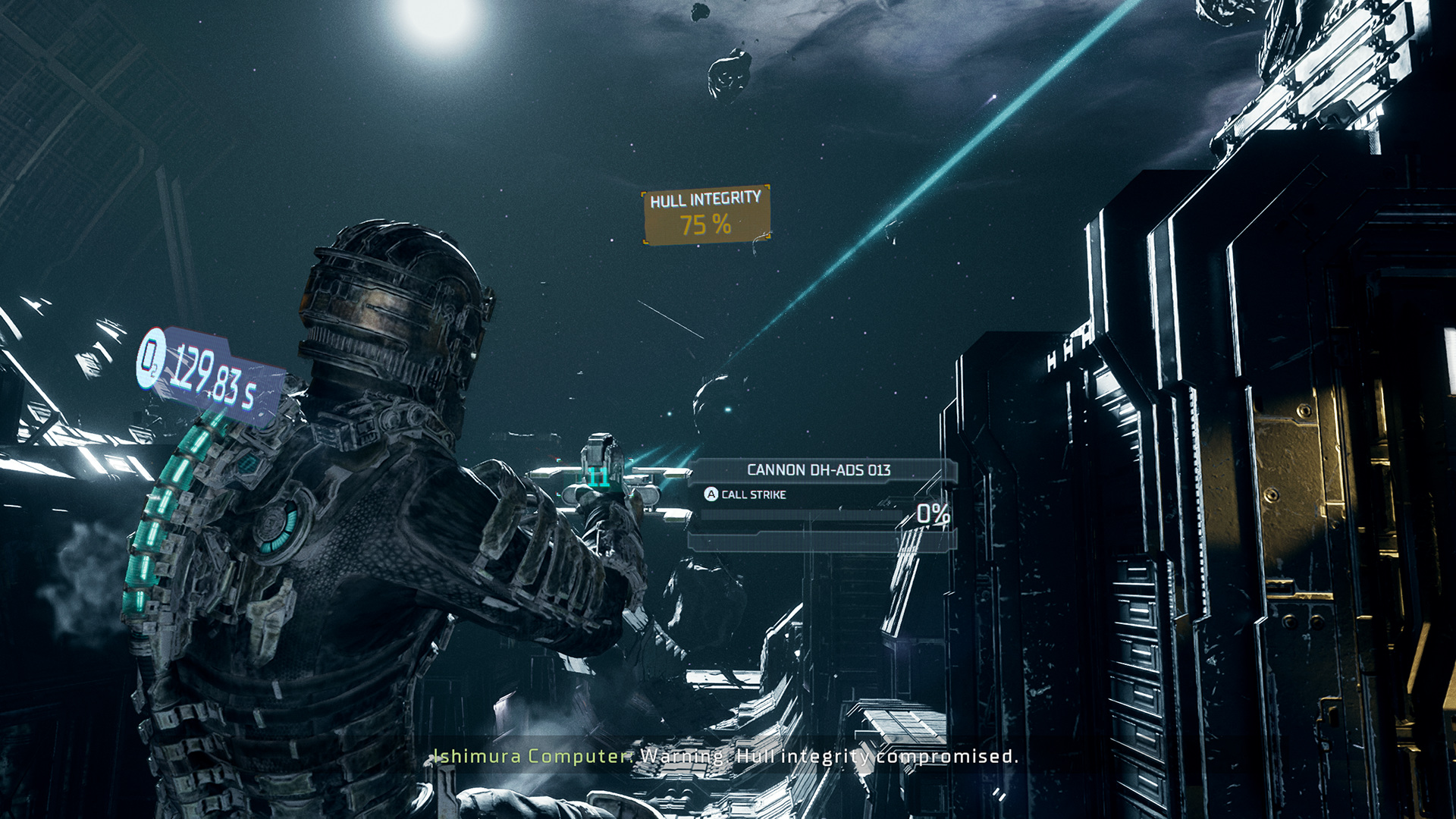
Dead Space uses minimal HUD elements at any given point to enforce the ambiance of being a horror game. TERMINUS is a cosmic horror game concept, so having the player experience similar to the way Dead Space designs its UI would help feed into the Sci-Fi Horror aesthetic

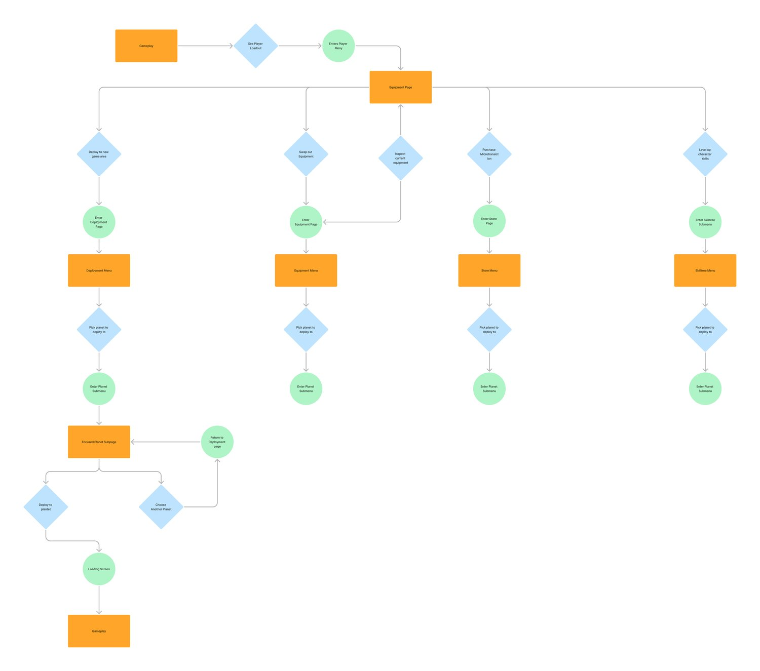
User Flow
The user flow of the Character Menu is inspired by Destiny 2’s character menu, where the equipment page serves as the landing page for the whole menu.
Visual Inspirations
The inspiration gallery tries to take both aesthetic and functionality designs from multiple games that either enforce an immersive experience within a stylized world,/or push forth live feature elements to further the GAAS features of TERMINUS.
Design Iterations
My main focus was to find a balance of hi-tech and occult designs that would make sense in the context of a science fiction, cosmic horror theme. I attempted to keep the color scheme as simplistic as possible and apply it over a range of situations, like item rarity and gameplay difficulty.

Main Menu
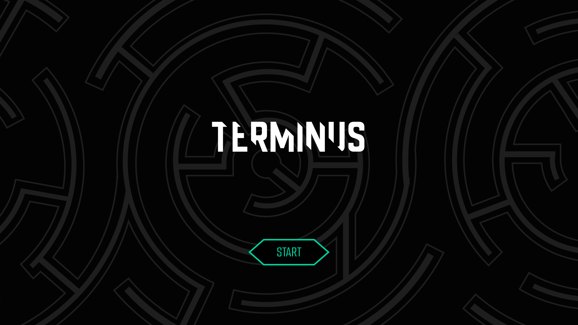
Start Screen
The start screen is simple in layout. A major concept present in Lovecraftian Horror is non-Euclidean geometry, so the designs were meant to mimic that.
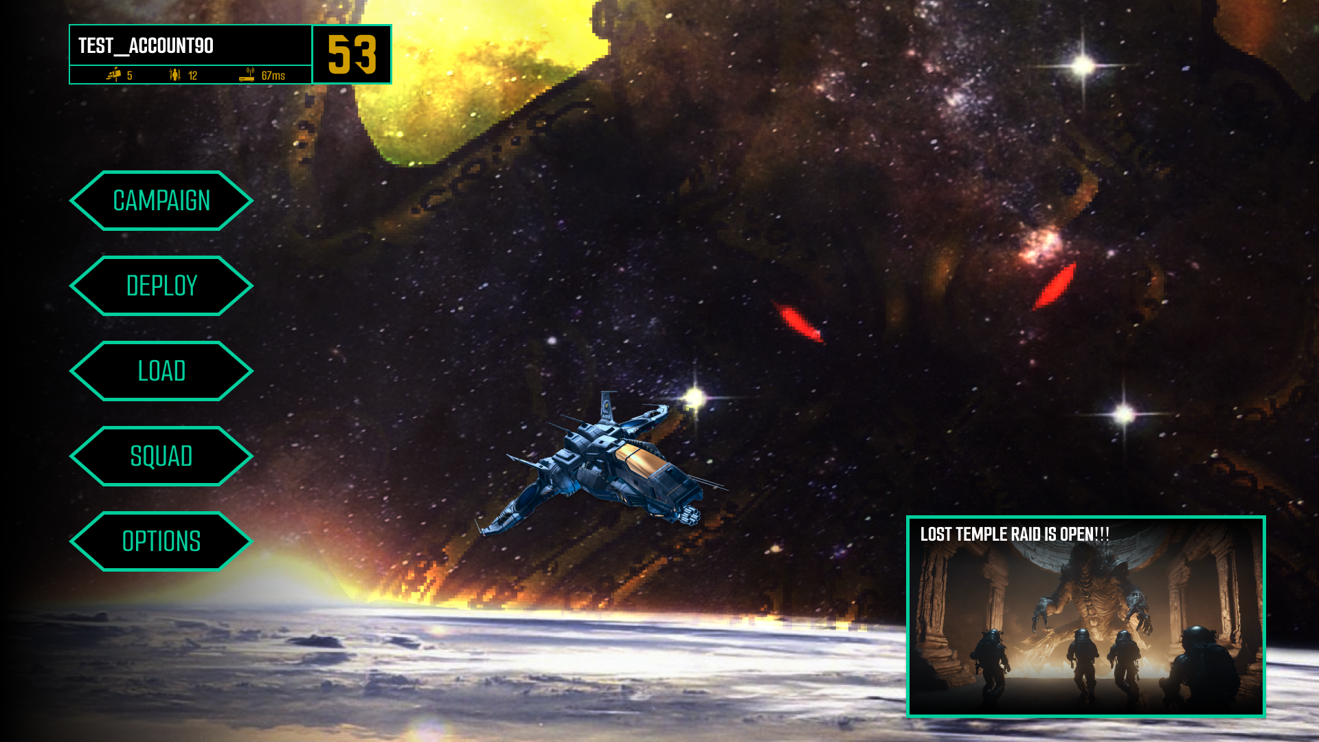
Home Screen
The home screen is given a simple design with a clearly defined navigation bar to the primary area of the game. Two widgets are placed in opposite corners: one is general player info for their only progress, and the other is a bulletin for any updates to the game or its store. The background will dynamically change depending on the last deployment location
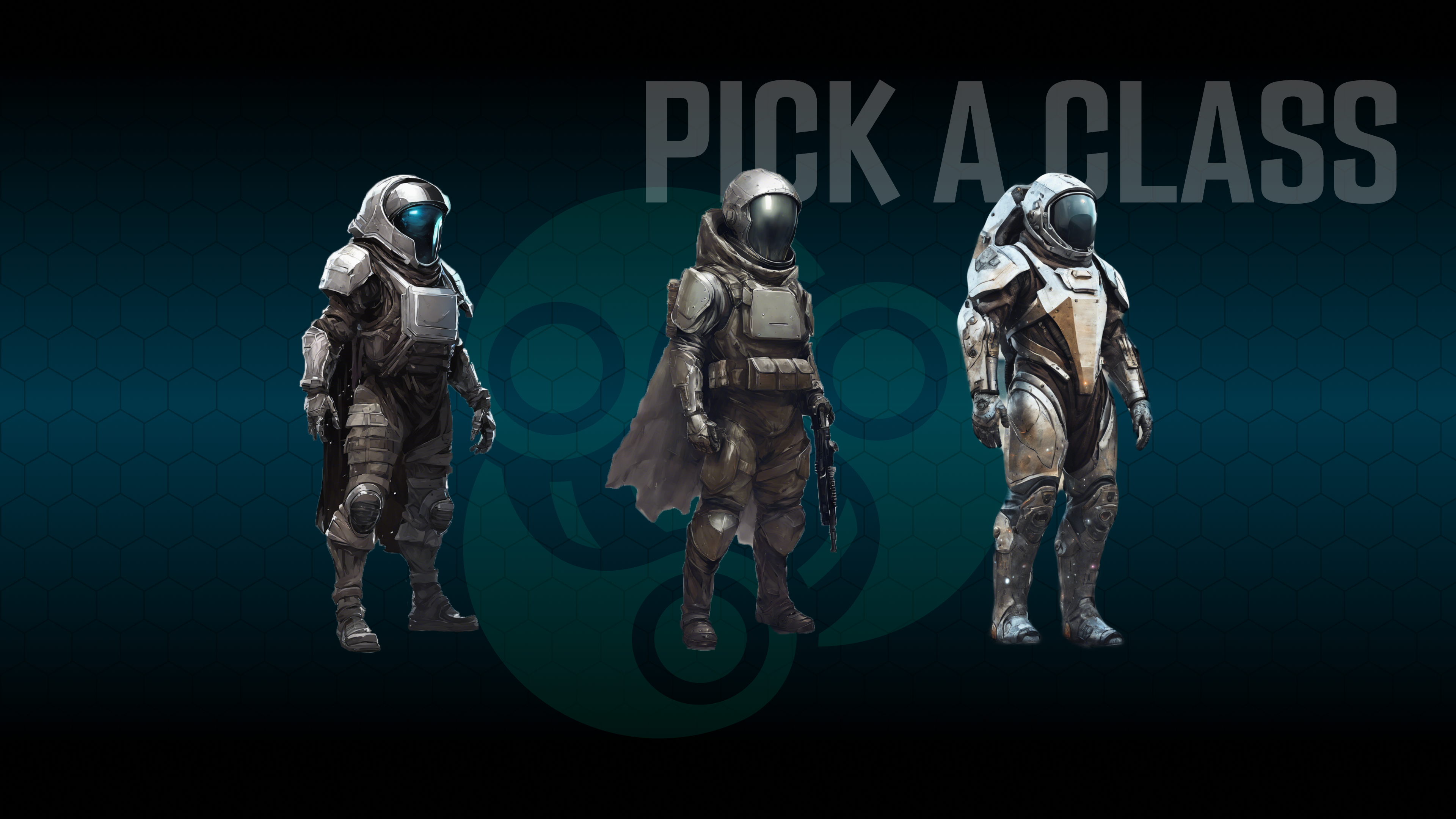
Character Creation
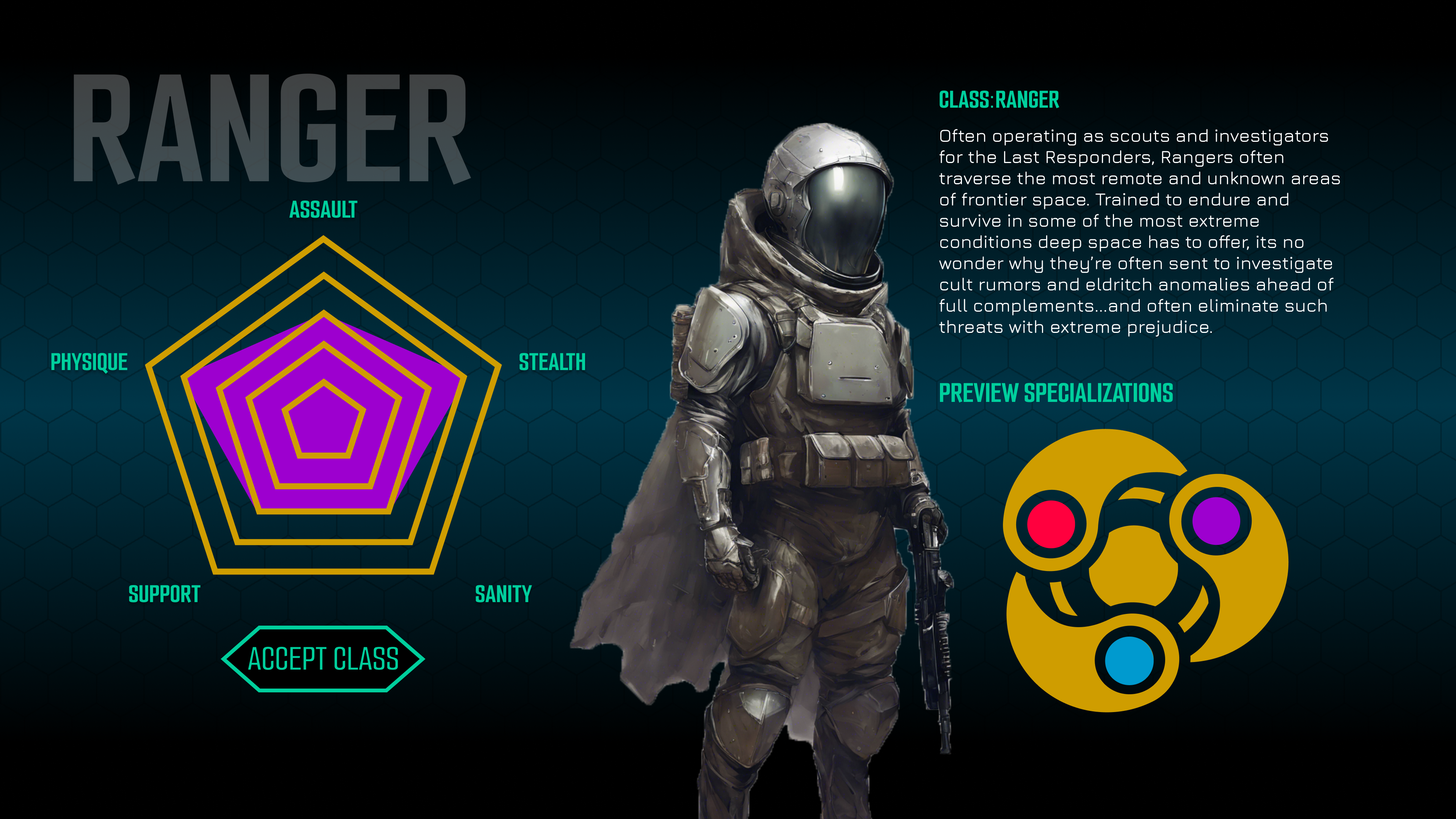
Class Selection
Players can customize the look of their character from a series of presets. The concept calls for very little need to see player characters’ faces during gameplay, so customization is very simplified. Class selection will allow for previews of any specialization class that comes with said class.
Player Menu
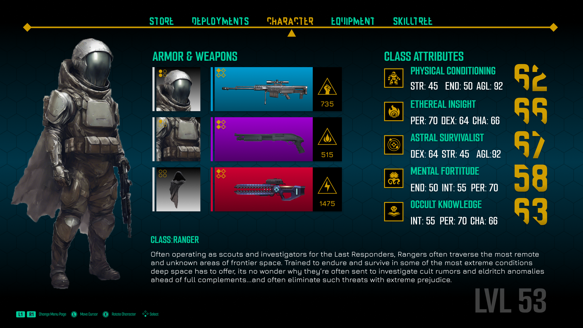
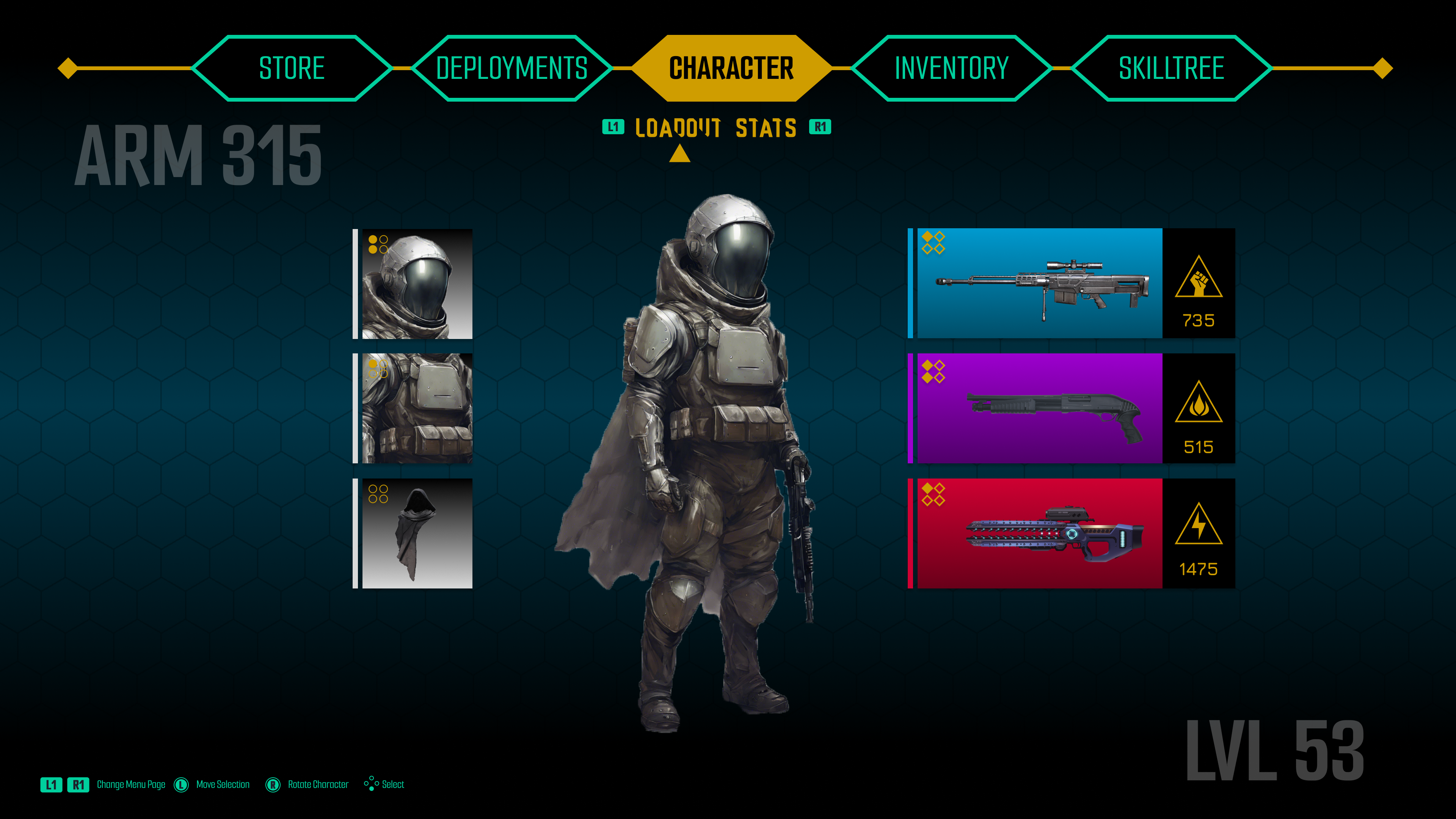
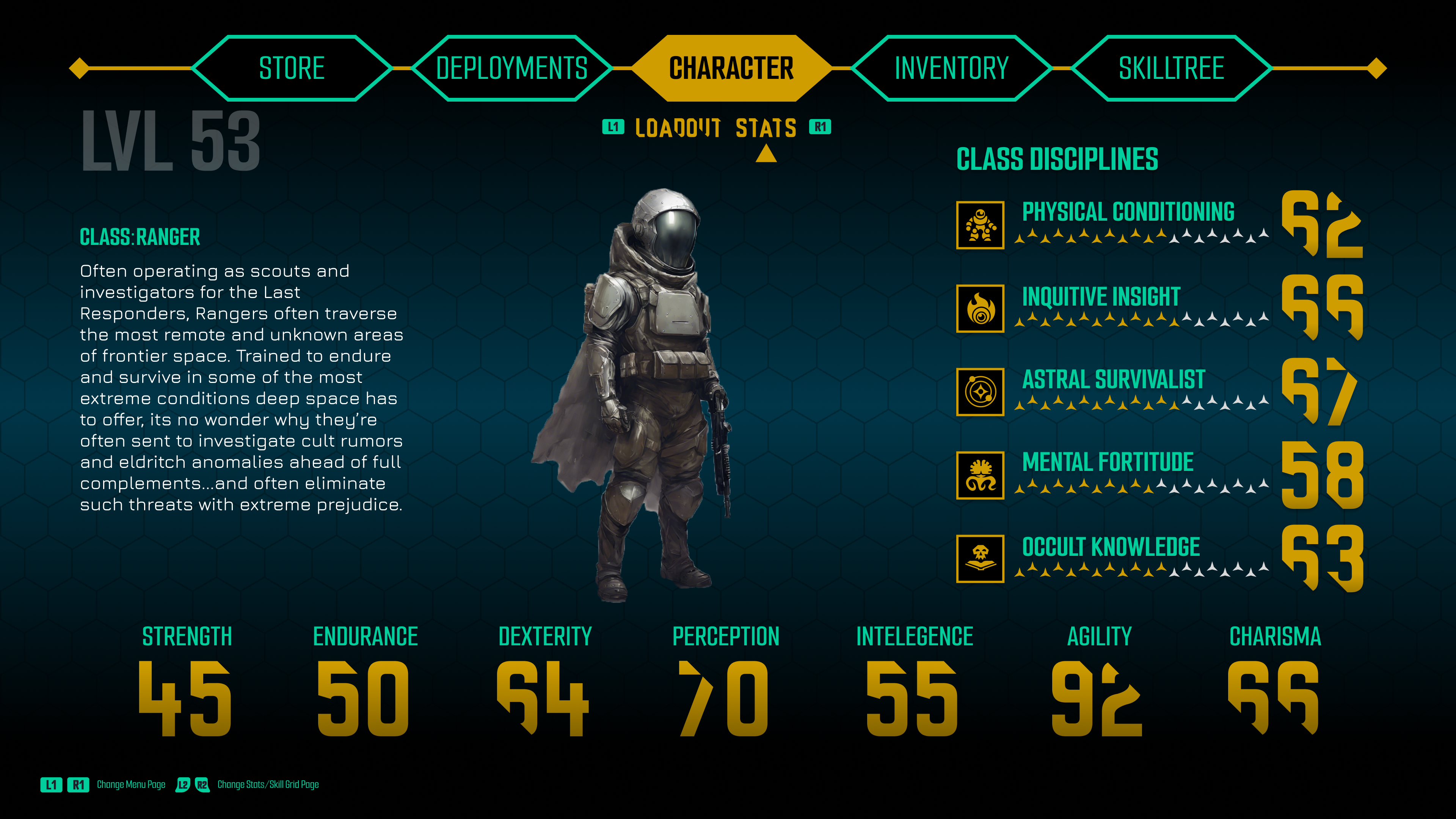
Character Page
The character page has two sub-menus: Loadout and Stats. Loadout shows all equipped weapons and armor, and interaction with any part leads to the inventory page.
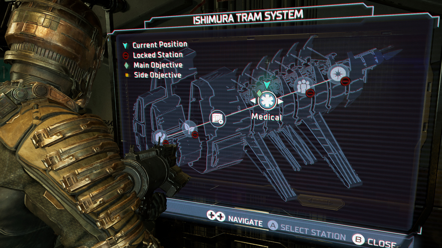
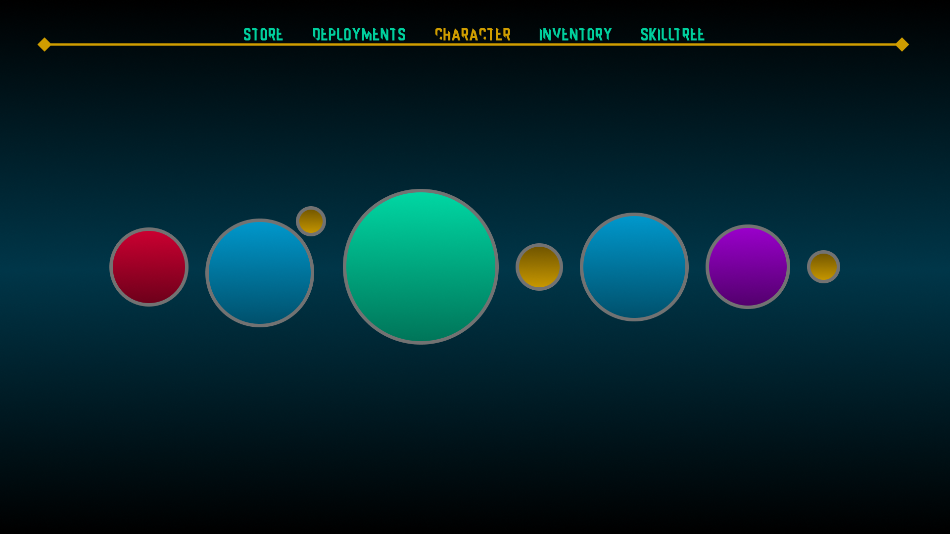
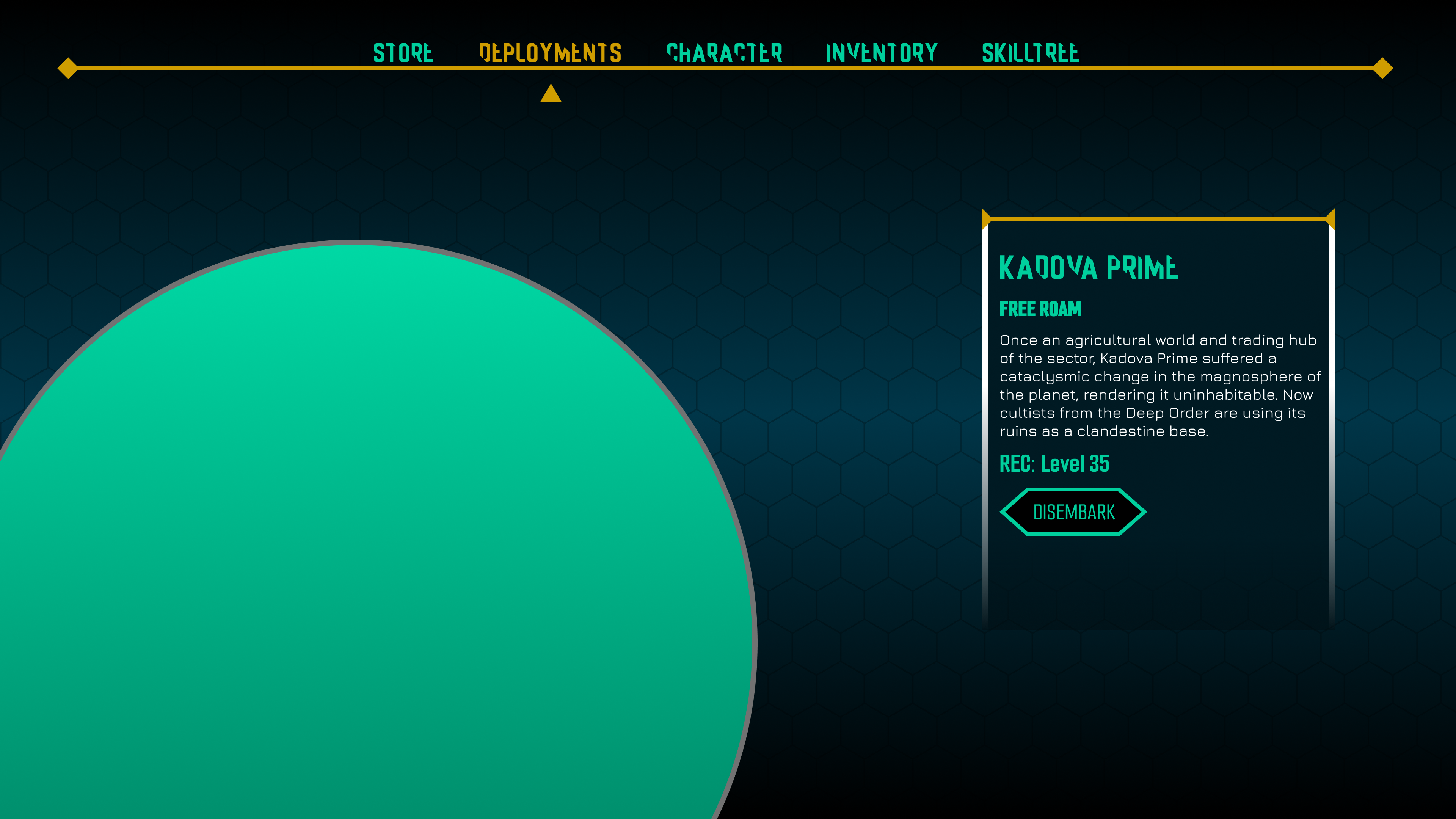
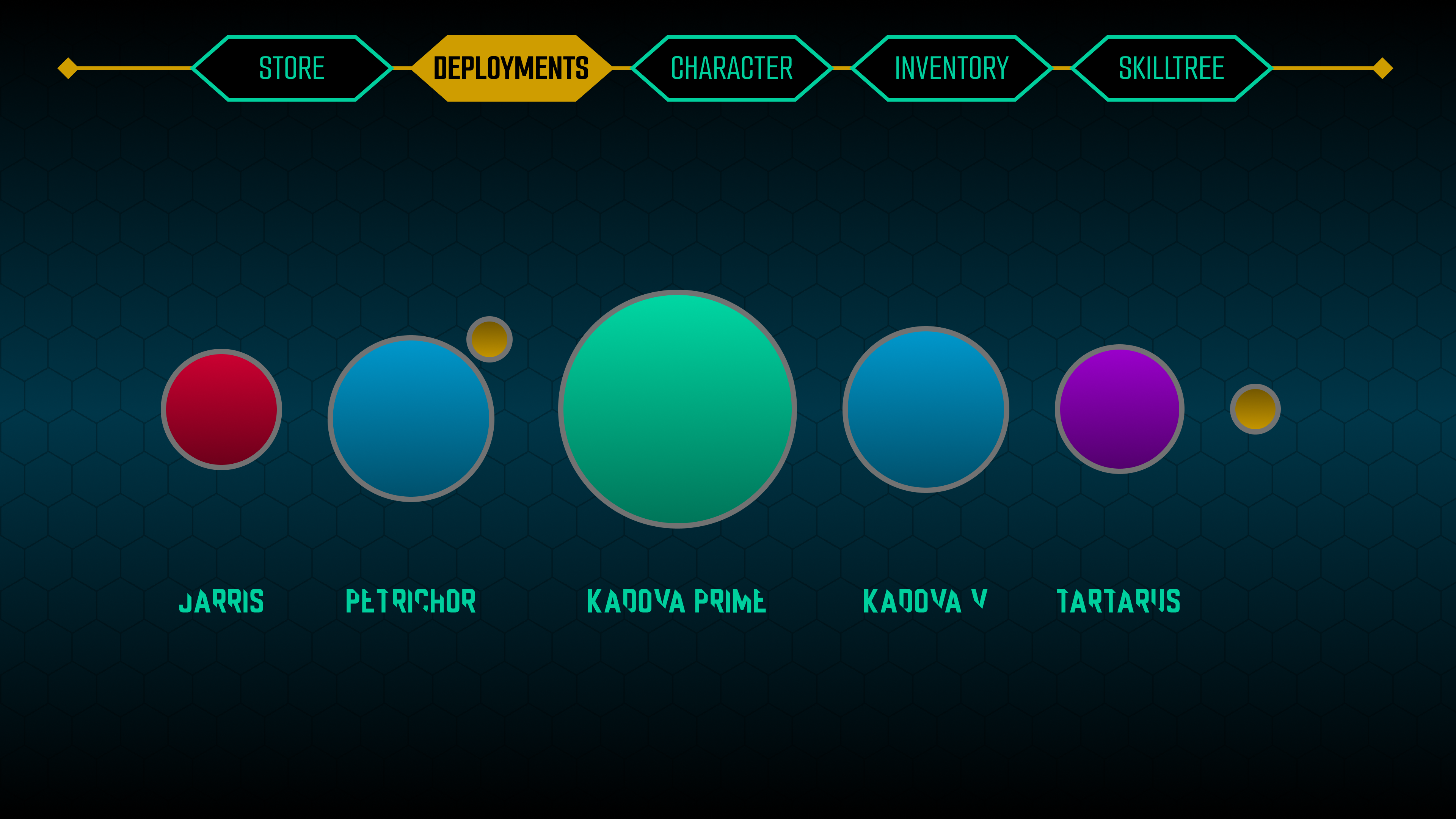
Deployment Page
The deployment page’s design is designed to be a minimalistic, 2D representation of a star system map. Color choices are similar to those of item rarity colors.


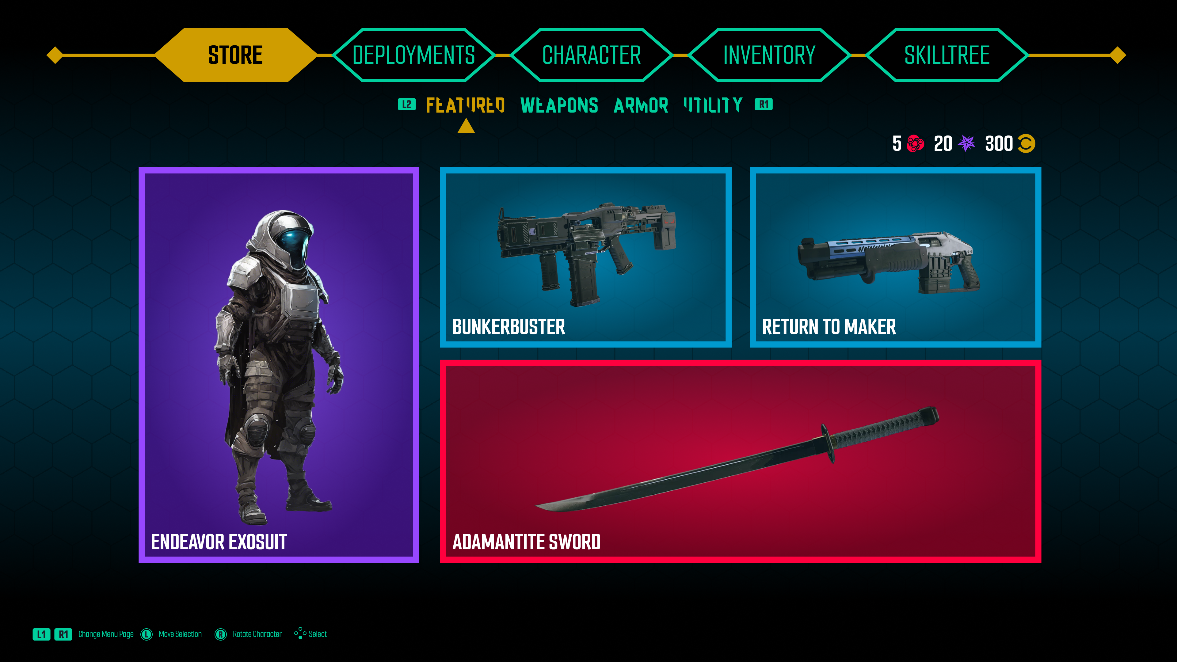
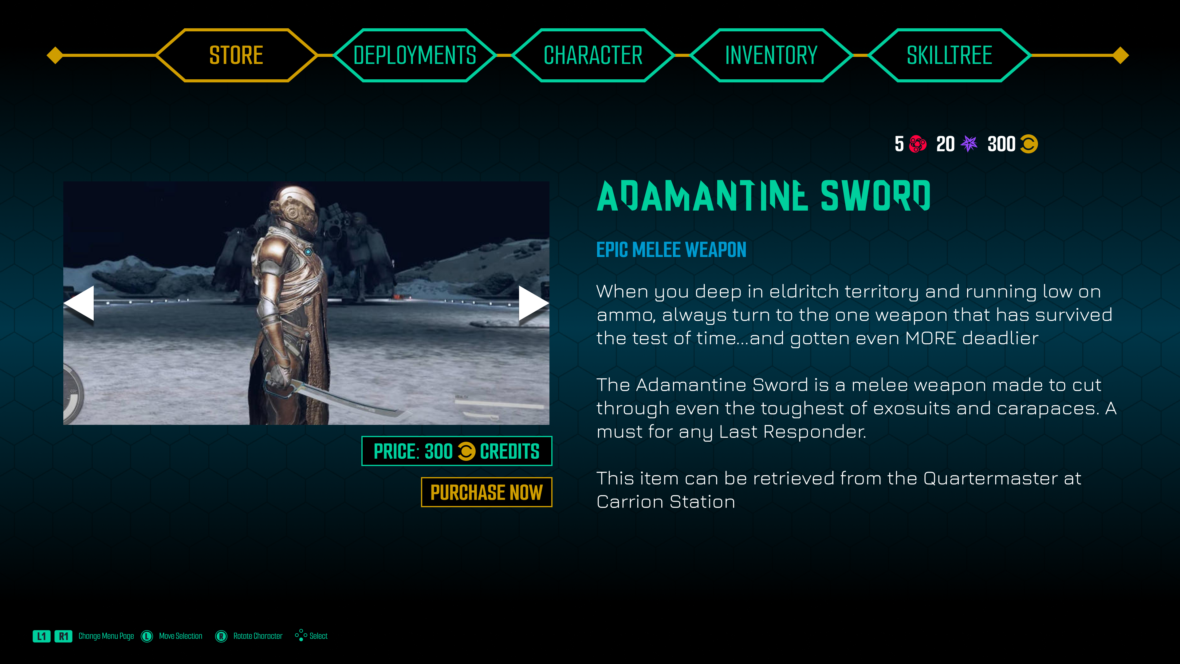
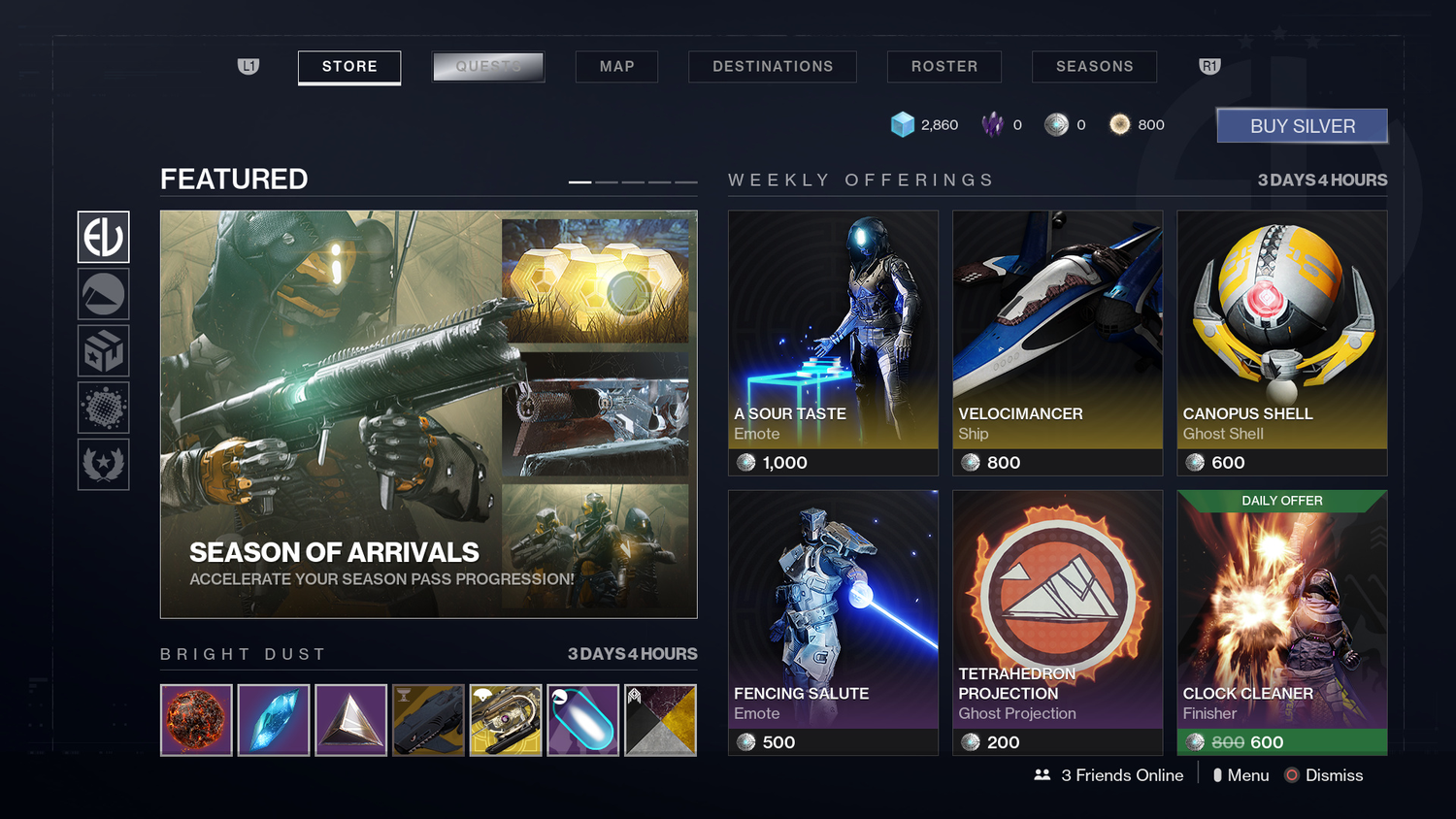
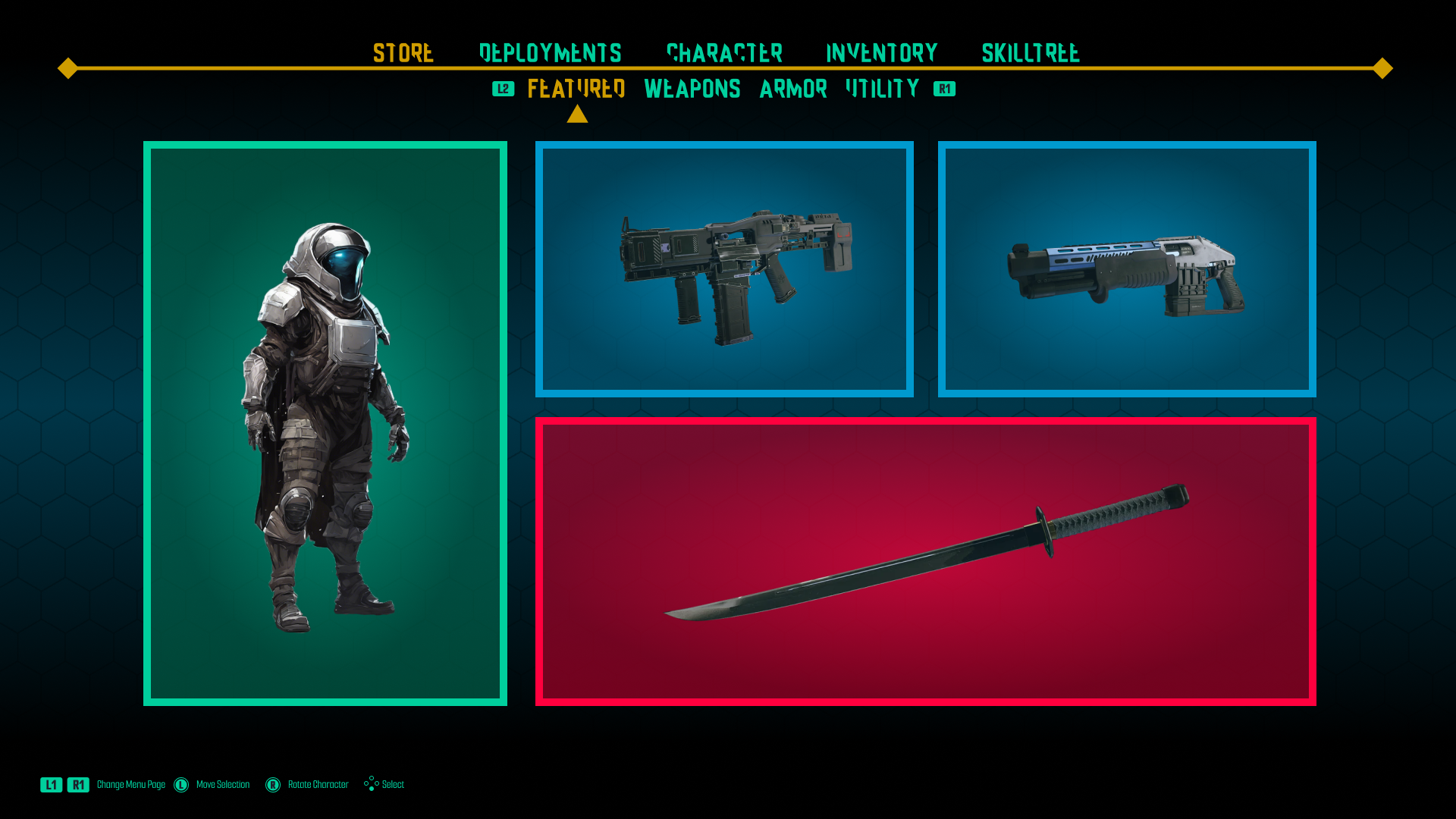
Store Page
The store page offers featured items, color-coded according to the universal item difficulty. Selecting any item takes players to a page with a basic layout featuring a carousel of images related to the item, lore information, and an interactable purchase button.
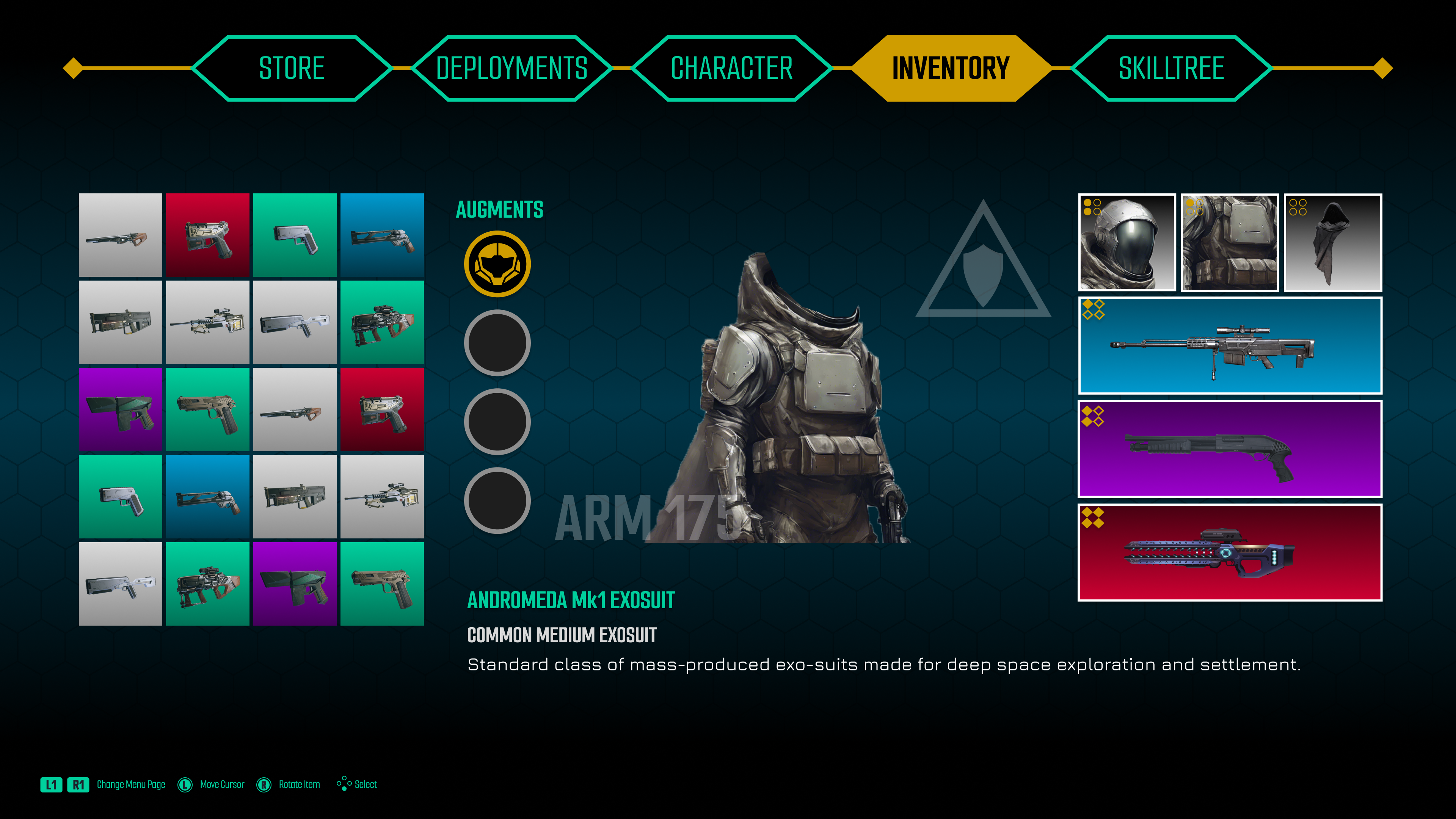
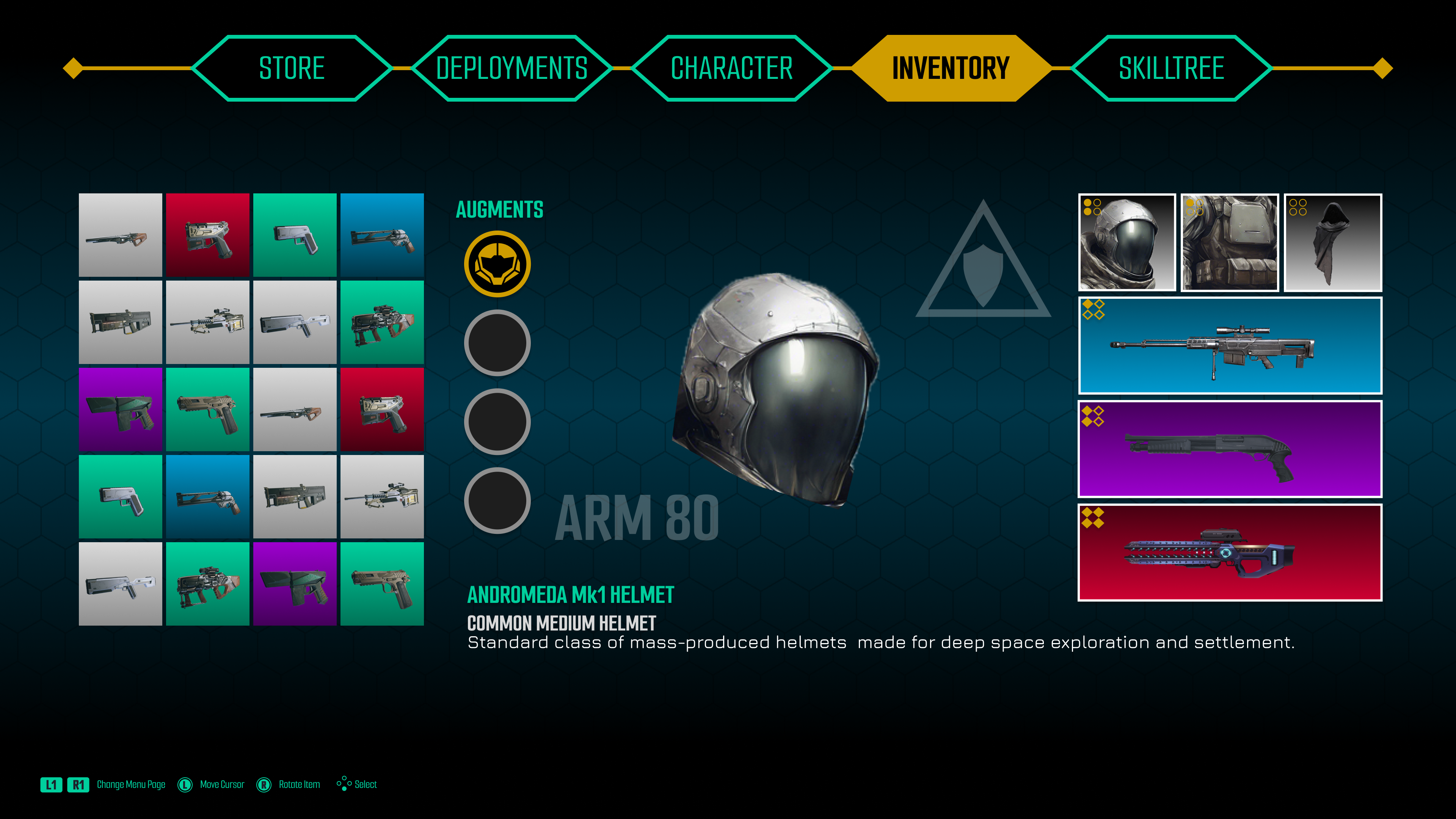
Inventory Page
The Inventory submenu allows players to display more in-depth information on equipped gear and any other gear currently in their possession.
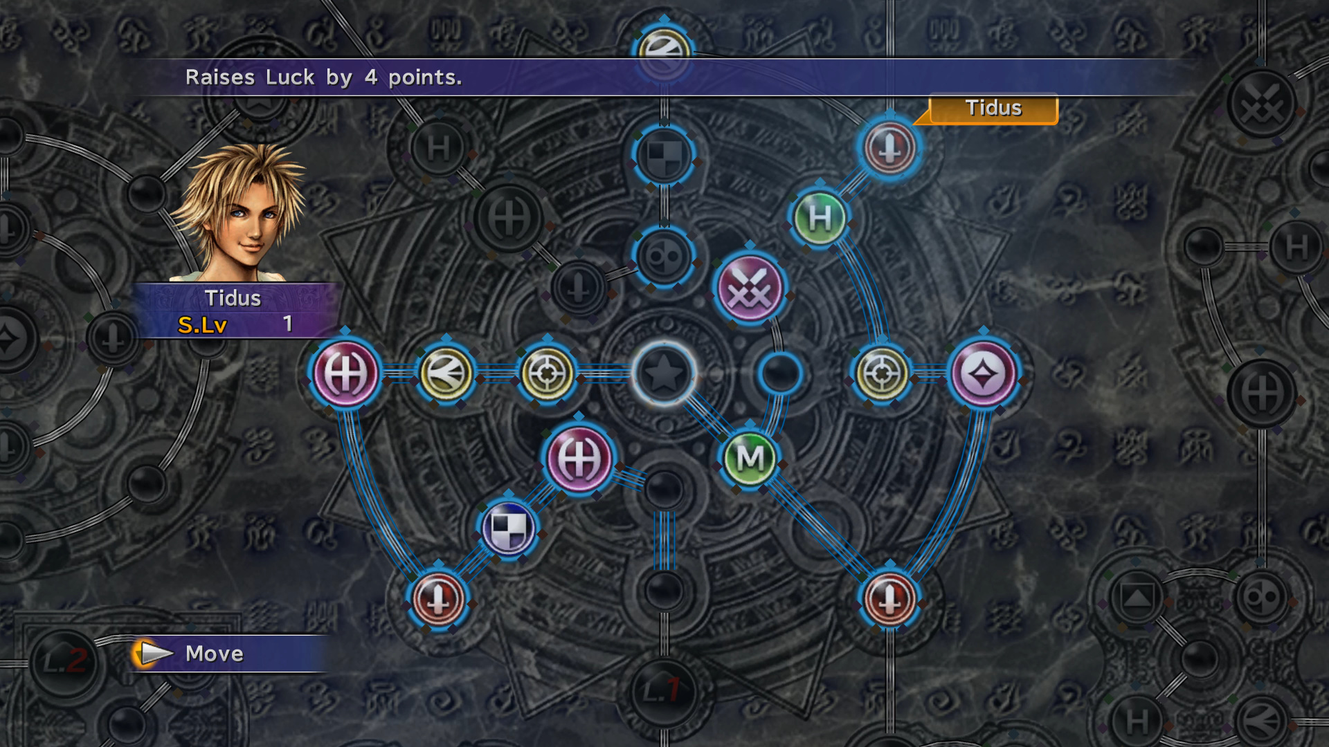
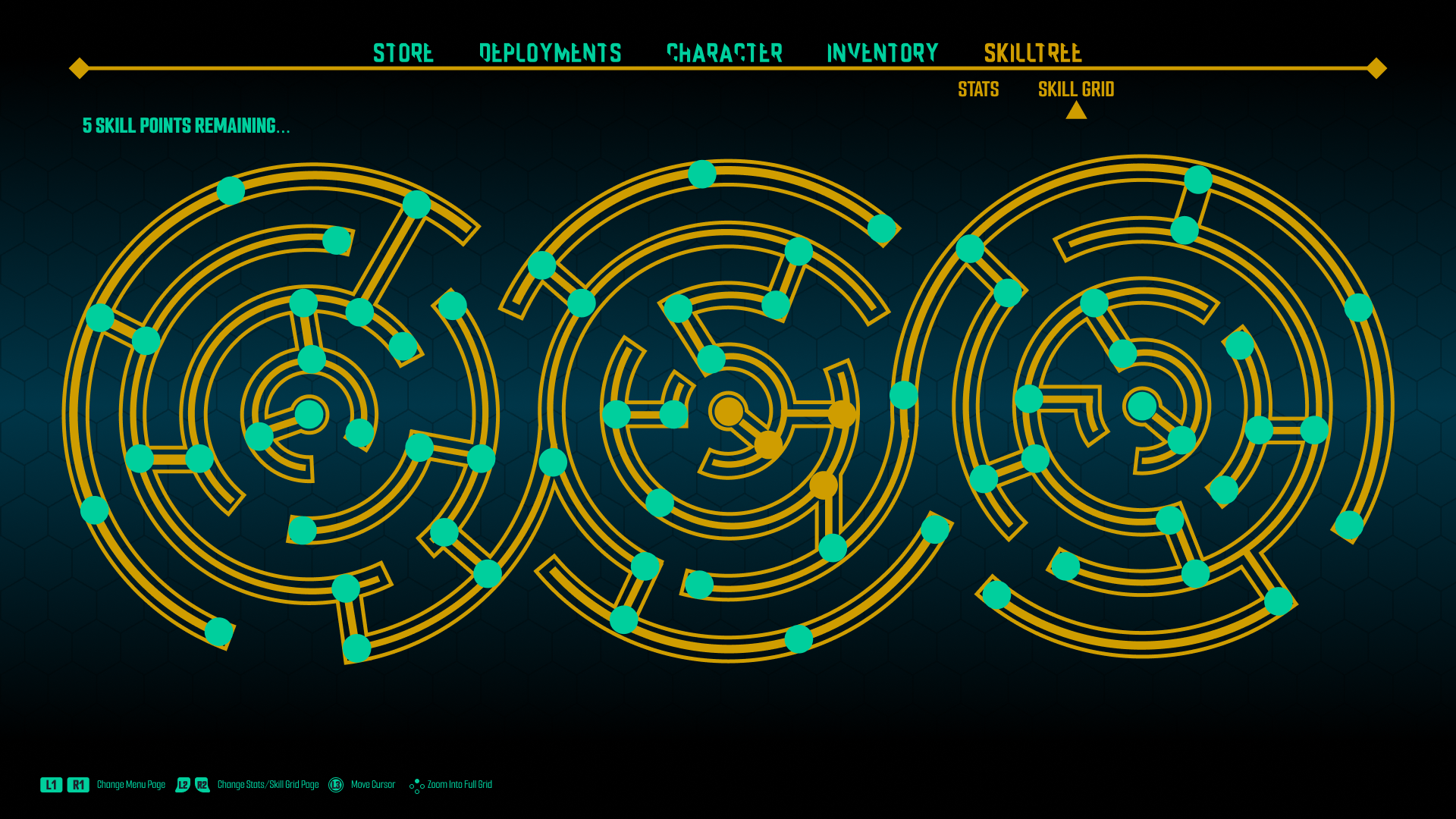
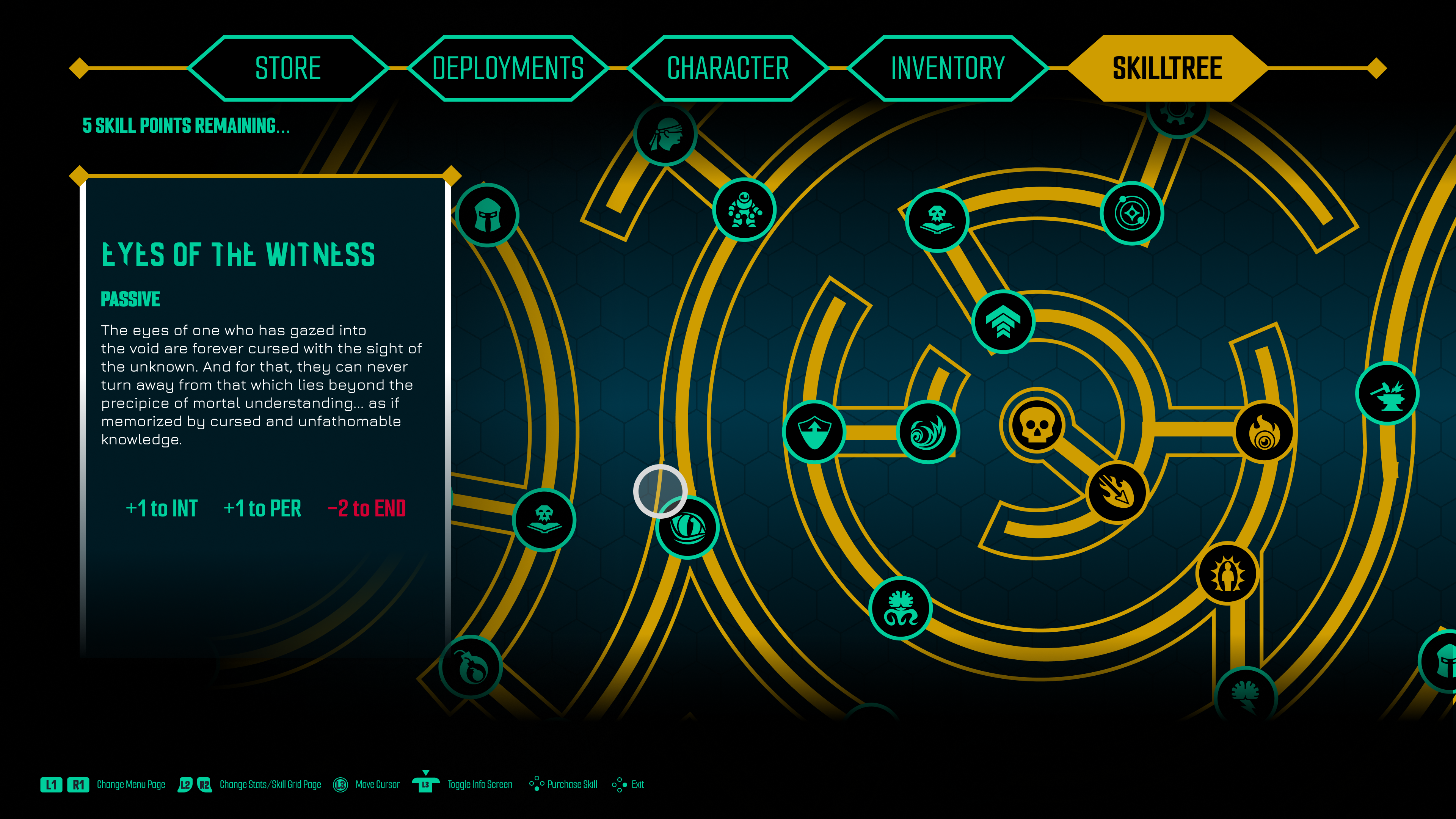
Skilltree page
This submenu is where players spend points to unlock new abilities on the grid. The grid design was inspired by the same non-Euclidean geometry that's present on the splash page.


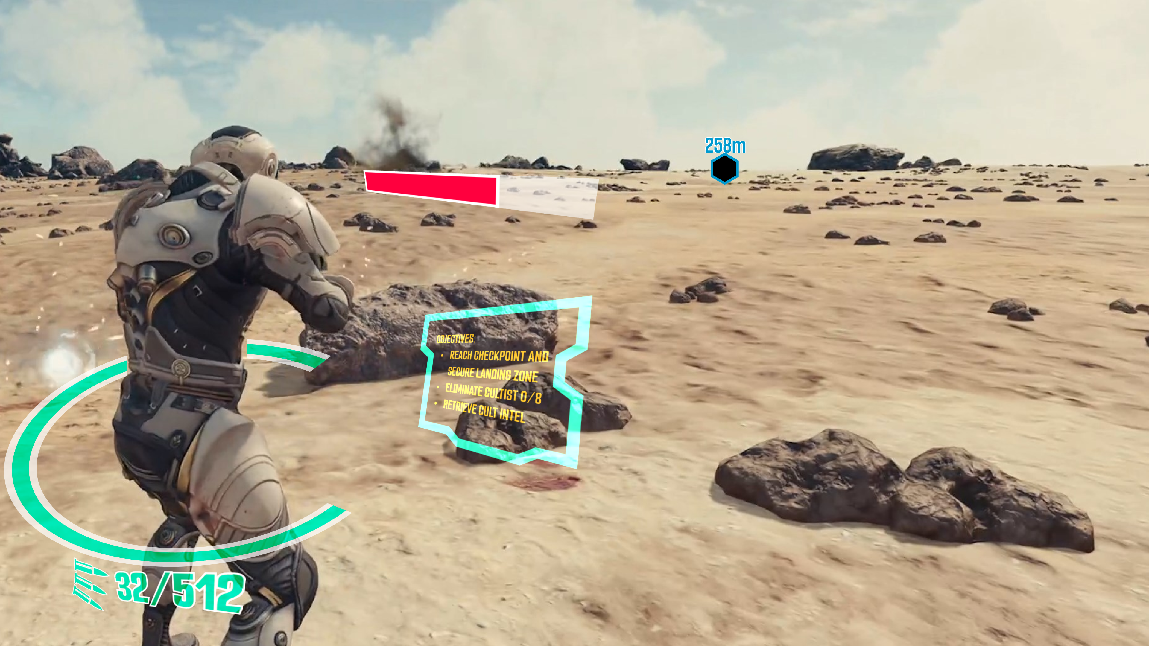
PLayer Hud
Player HUD features during gameplay will be dynamic. Instead of there being static 2D widgets, they’ll be on a 3D plane surrounding the player character like AR/holograms, appearing and disappearing based on the current gameplay situation.

In making this game concept, I had to ask myself what about this design sets it apart from the games that inspired it. Is it the story? Is it the UI/UX? Is it a feature? Or would it be doomed to fail like all other GaaS titles before it? The difference between designing a user experience and a fun experience is drastically different, but dependent on one another. A bad UI can make a fun game frustrating, while a great UI doesn’t matter if the game isn’t fun.
“Live Service” has become a toxic phrase in recent years, but the model can be successful if the gameplay and experience are there and not bogged down in predatory schemes. From World of Warcraft to Destiny, to Final Fantasy 14 — they all exemplify this. What made all those games good was that they made you care about your characters, and they put the community first. In making this concept, I feel that I could have done more to design interfaces that pushed for community — squads/clans, voice chat interfaces, etc. Looking back now, this concept might be one of the ones that wouldn’t make it if developed as is.