In the age of content creation and social media, there are creators always looking for the newest platform to stake a claim. Every platform has its pros and cons. But one of the main things the creators look for is the discoverability of their content. So this project is a concept for a video-sharing app that prioritizes discoverability.
CLIENT: PERSONAL PROJECT
ROLE: UX, Interactive, VISUAL DESIGNER
TEAM: SOLO CONTRIBUTOR
TIMELINE: 1 WEEK

PAIN POINTS
Making a platform for newer and smaller content creators to grow their brand through dedicated discovery systems is only half the issue. The other half is keeping the audience on the site itself to discover more of said content. So, in short, three primary issues have to be addressed.
Lack of a system that promotes content discovery from creators of all audience sizes.
Lack of means for Users to engage with the content through interactivity and navigation.
No way to promote user retention to feed into the discovery of New content


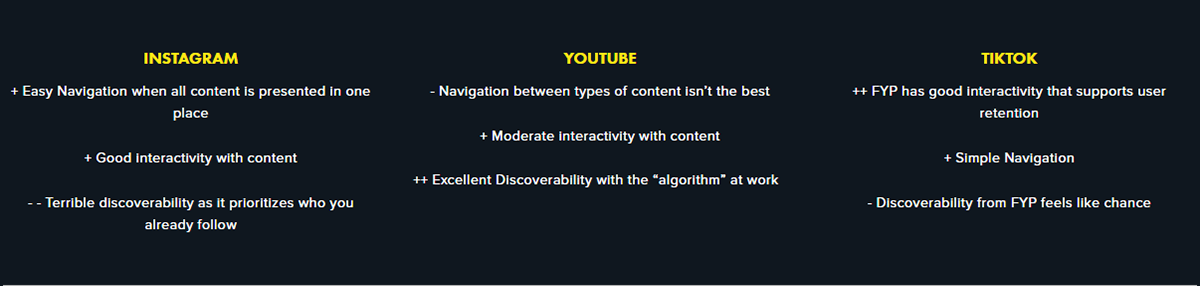
Competitive Analysis
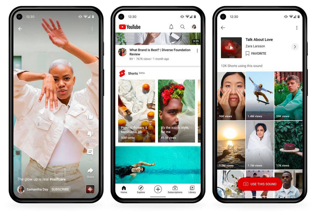
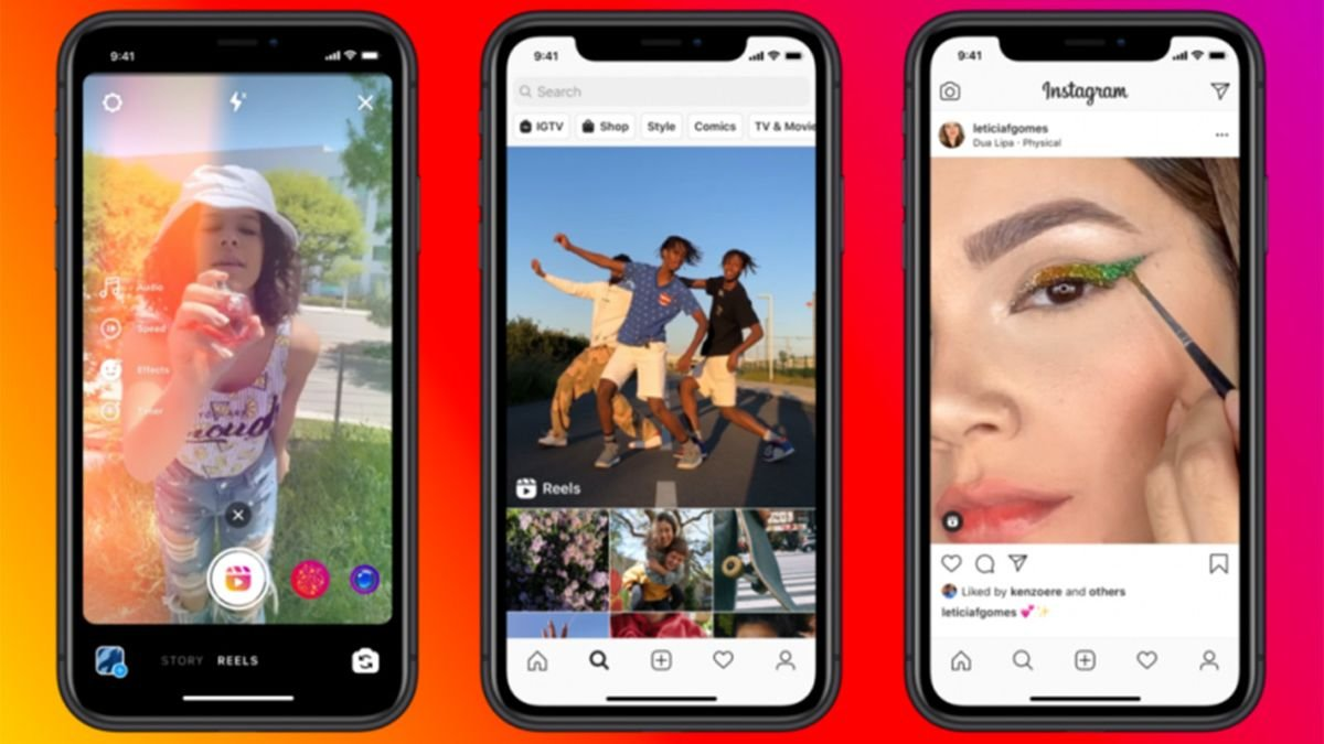
This app concept is in direct competition with YouTube, TikTok, and Instagram. The comparative analysis is based on navigation, interactivity, and user discoverability. The takeaway is that the focus for the app moving forward should be on three specific categories: Discoverability, User Retention, and succeeding in the competitors’ biggest flaws.

Visual Inperiations
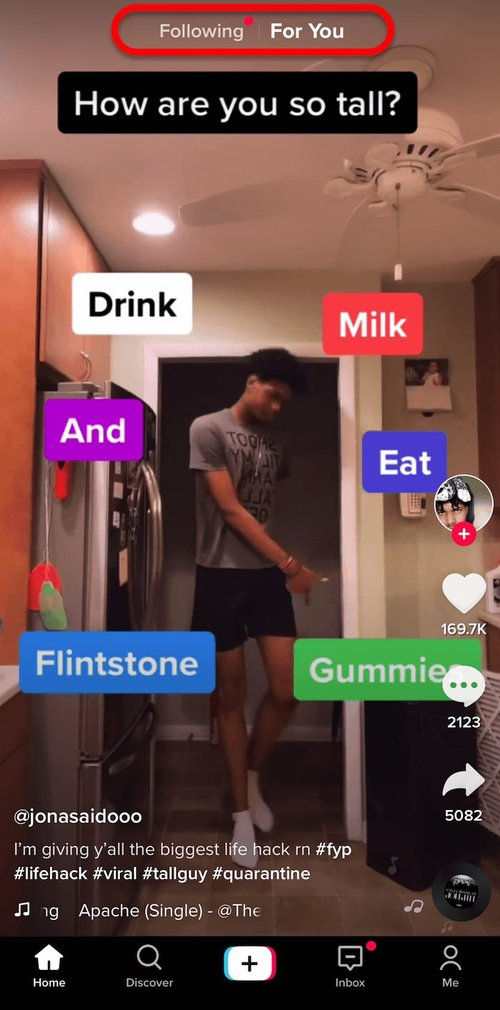
YouTube’s Shorts feed, TikTok’s FYP page, and Instagram Reels each played a part in shaping the video aesthetic I envisioned when scrolling through video feeds.
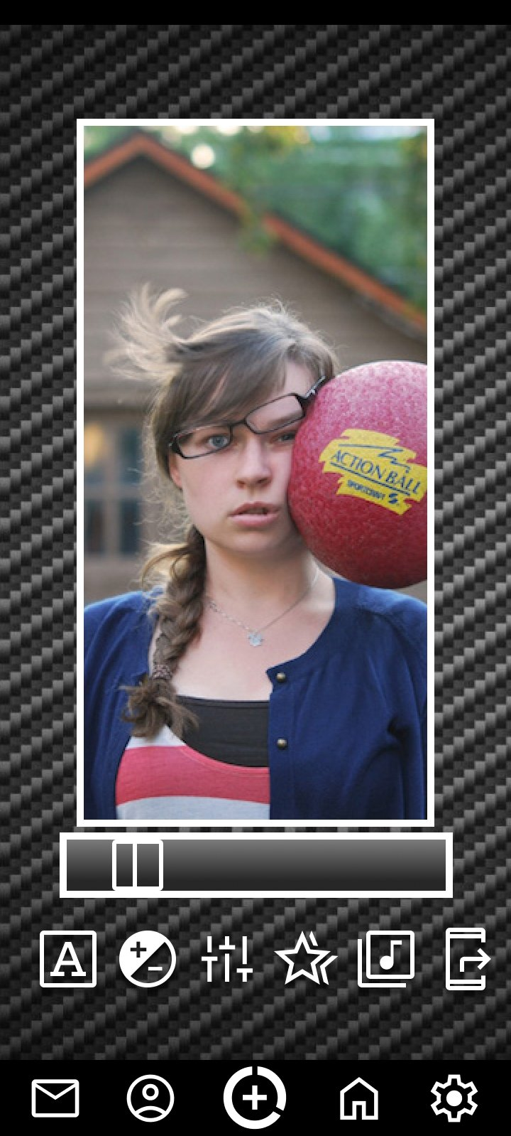
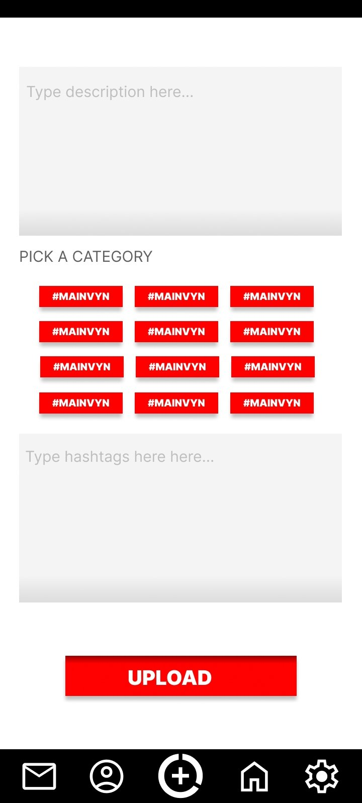
Design Iterations
Wireframes and mockups were made by taking the most established layouts across most social platforms and then reworking them in a way to suit the discovery-based mechanics of the app functionality.
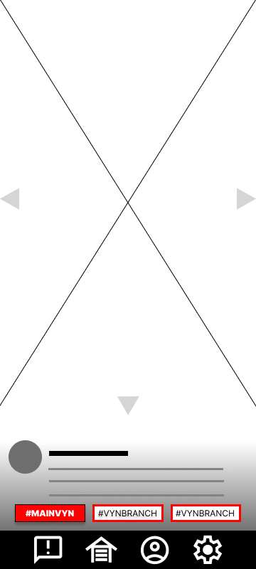
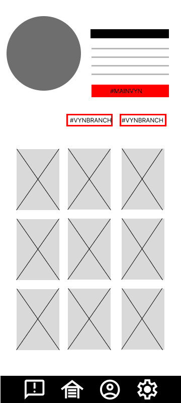
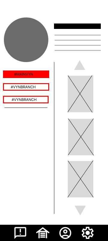

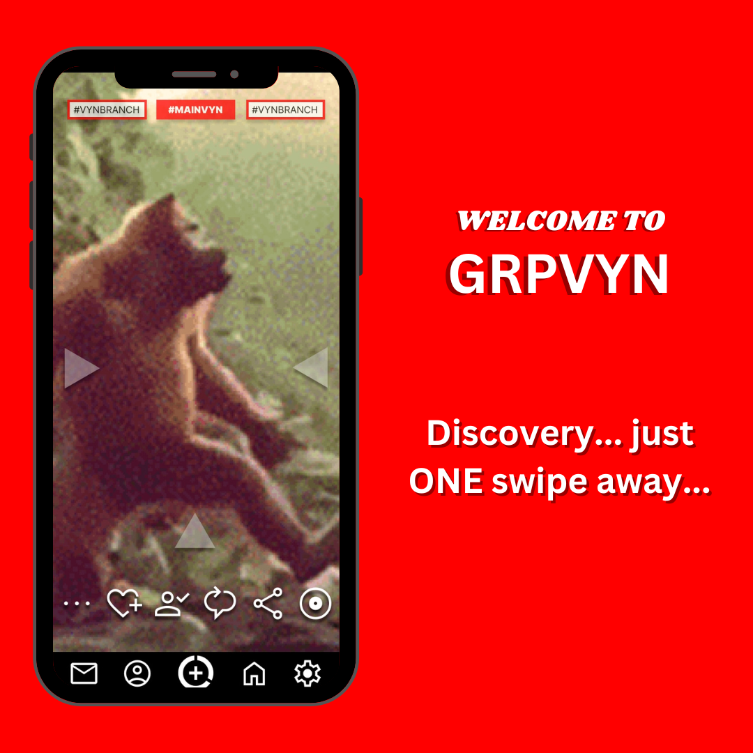
The concept I came up with was "GRPVYN" (pronounced Grapevine), derived from the saying “Word through the grapevine…” Conceptually, it allows users to travel down niche content by way of broader topics.
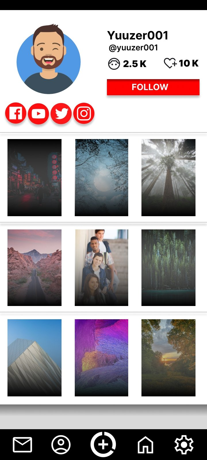
VISUAL LAYOUTS
The color palette was simple, using RED as the primary color. All other colors were achromatic.
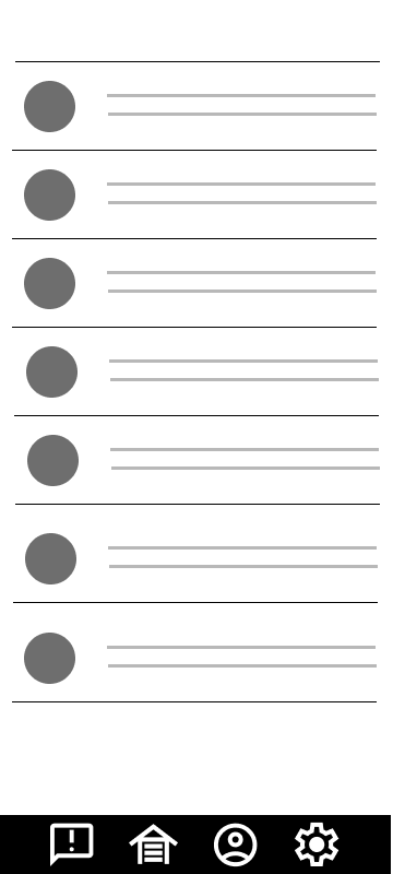
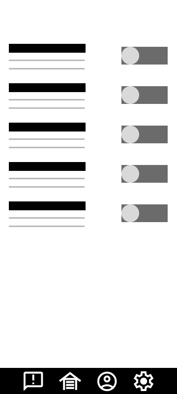
The navigation needed to be familiar and as simplistic as possible, taking the general bezel-to-bezel real estate idea from major platforms.
INTERACTIVITY
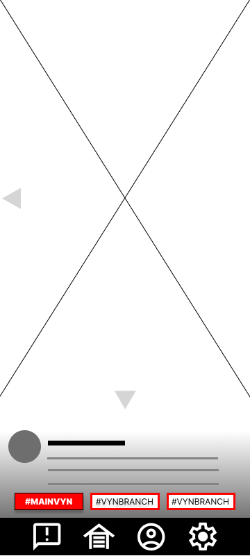
This design was meant to increase the retention of users in the app with navigation that bolsters creator discoverability by pushing users down a variety of topics at a swipe.
NAVIGATION
Swiping in the direction of the hashtag elements at the top will either lead you into a new branch of the main topic or down deeper into the topic the user is already on.


As a long-time content creator, discoverability is a major issue. There have been times when I put my all into making the best videos, only to see the numbers flop in the metrics. What I presented is by no means perfect, and there are plenty of improvements that could still be made. In my attempt to simplify the navigation, the thought of accessibility hadn’t crossed my mind. How would someone navigate the feeds if they didn’t have use of their hands? More research into it could have been done in the competitive analysis to see how the big platforms handle that issue. But as a first attempt at a fully executed UX case study, I will say that I think this came out better than I expected.