Starfield launched at the start of the fall of 2023, and despite its initial accolades, parts of the game felt hollow or “missing”. This lack of visual design would also be a trending theme in other game areas like shipbuilding and crafting. For this project, I’ll focus specifically on redesigning the Inventory UI for the game.
CLIENT: Personal Project
ROLE: UI/Ux, Visual Designer
TEAM: Solo Project
TIMELINE: TWO months

Problem Statement
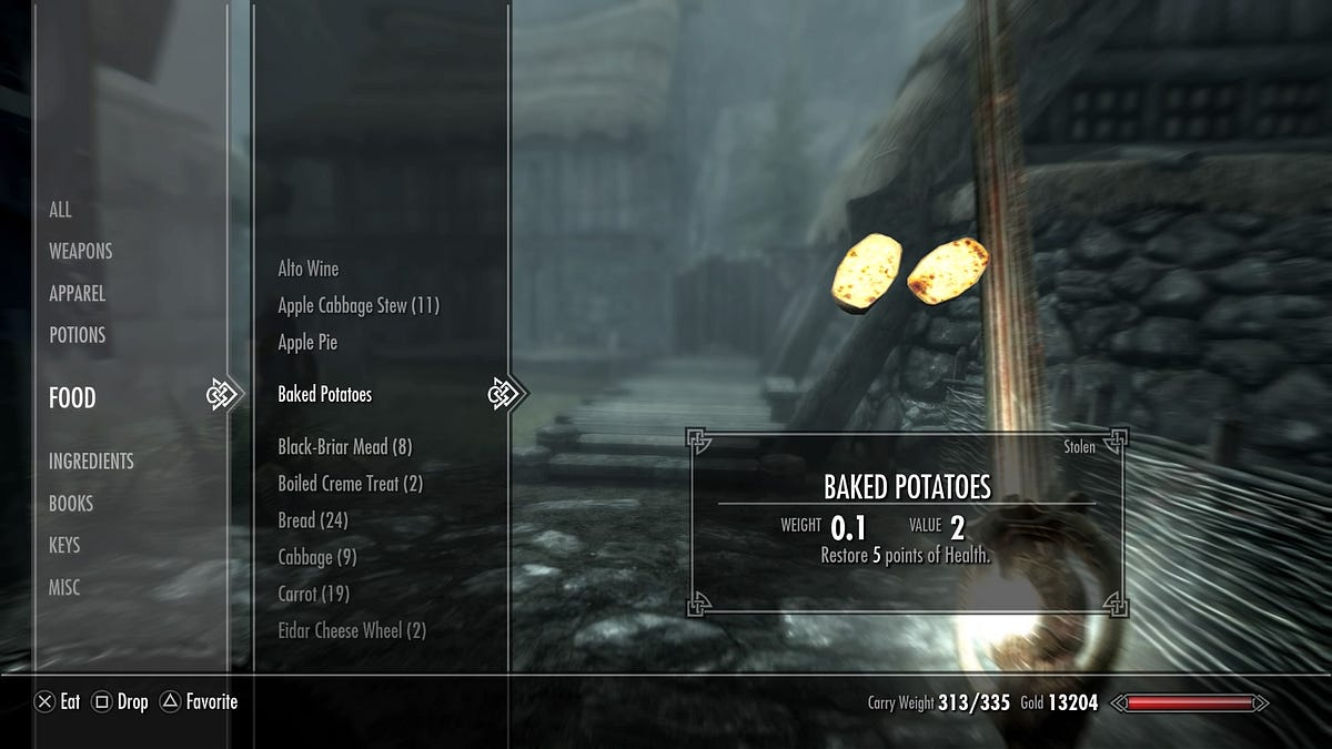
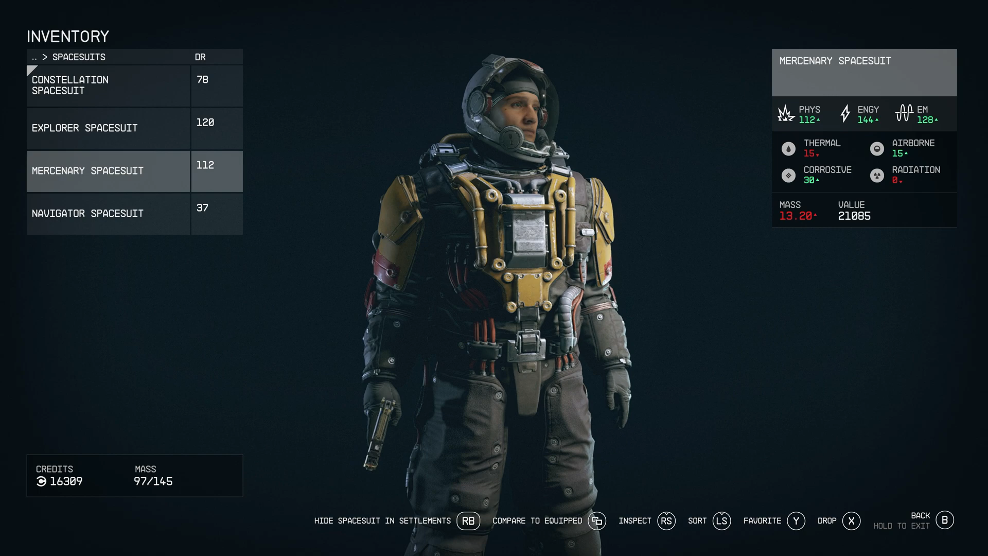
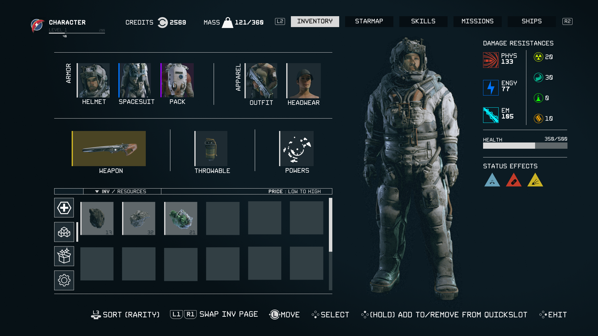
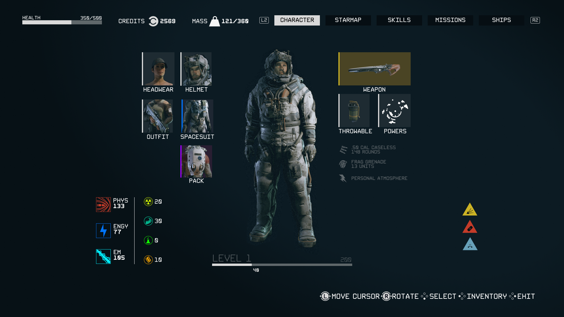
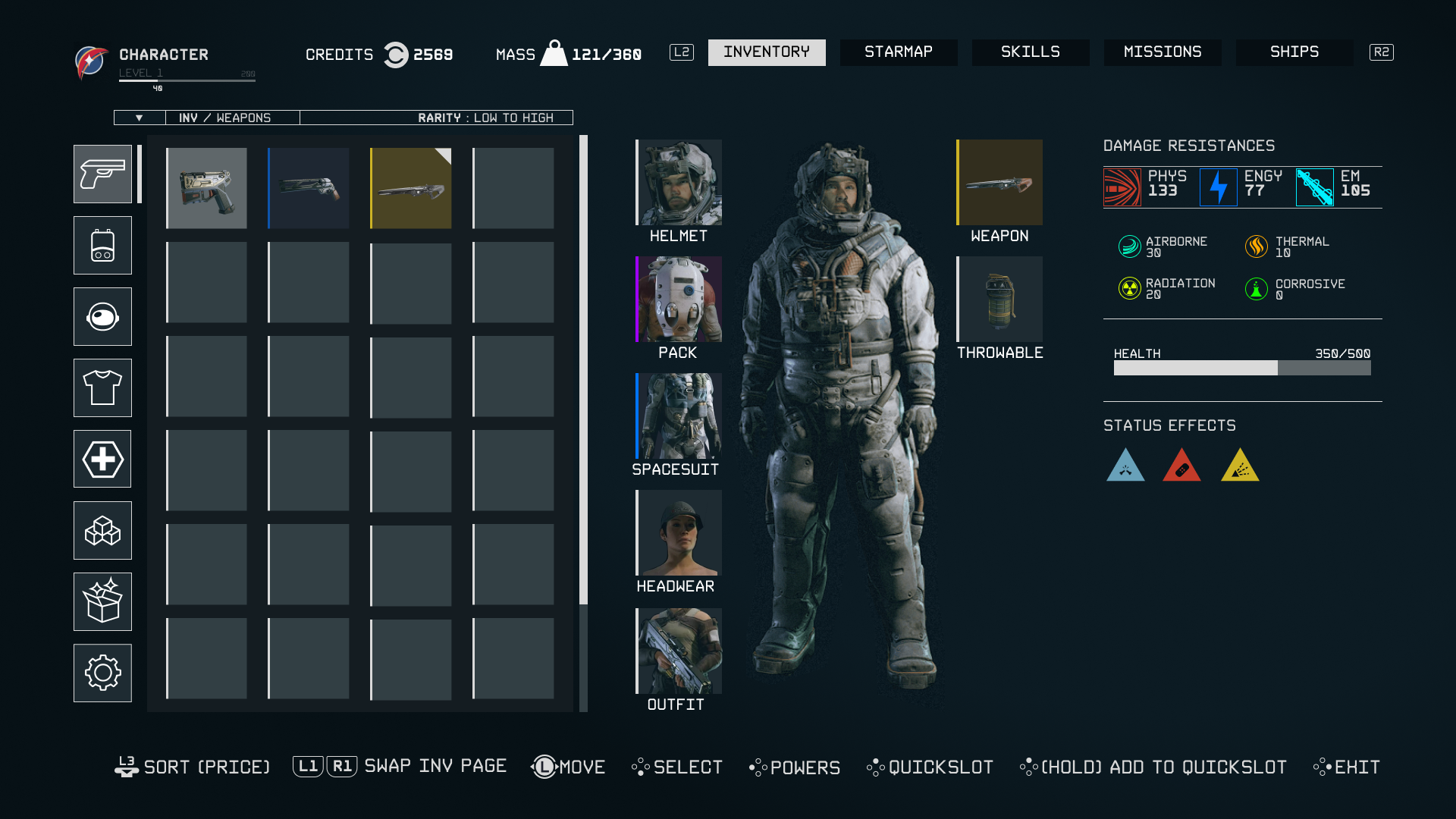
Starfield's inventory interface lacks the utility found in traditional RPGs, trading many organizational and statistical features for a heavily simplified layout. This progressive simplification has become increasingly prevalent in Bethesda games over the past 20 years, as illustrated in the images below.
Objectives and Goals
1) Create an interface that falls more in line with traditional RPG UI designs
2) Make usability similar, if not the same, between PC and Console
3) Simplify navigation between different menu screens
We Started Here...
...Got to here...
...What is this menu?
...OMG.

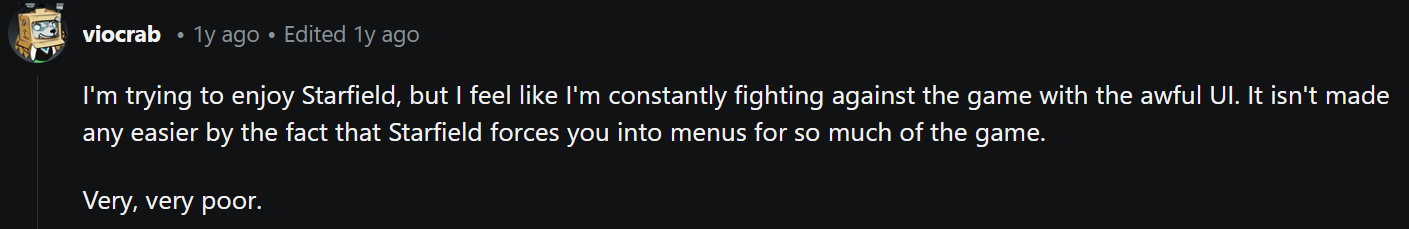
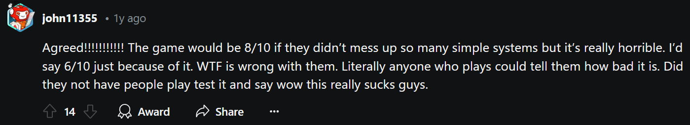
REDDIT
The best way to gather the opinions of people who play Starfield regularly is to visit places where they frequently complain about it. The Starfield subreddit yielded plenty of “constructive criticism” in the way of some of the UI choices Bethesda made


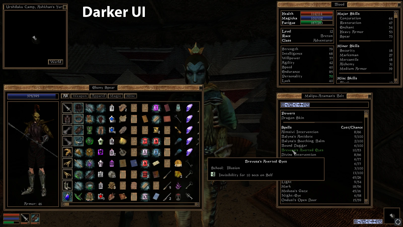
NexusMods
Visiting the modding archiving site NexusMods, I came across a mod that improves the usability of the inventory system, called StarUI. There are clear takeaways that can provide insight into what kind of usability players expect from their inventory interface.


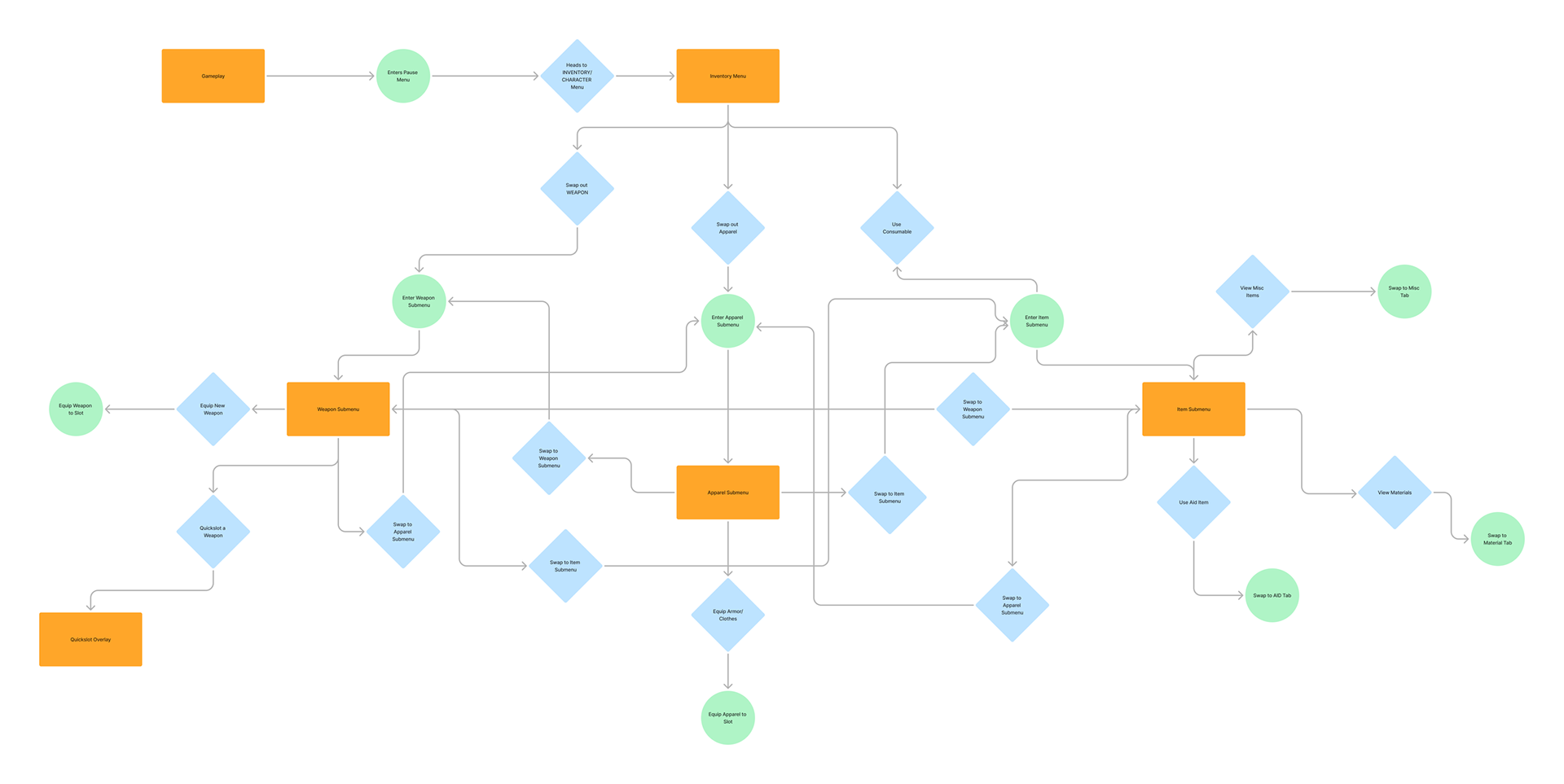
Redesigned User Flow
The user flow of navigating through the main menu to the Inventory is straightforward. The key feature to implement is a seamless transition between all submenus within the Inventory.
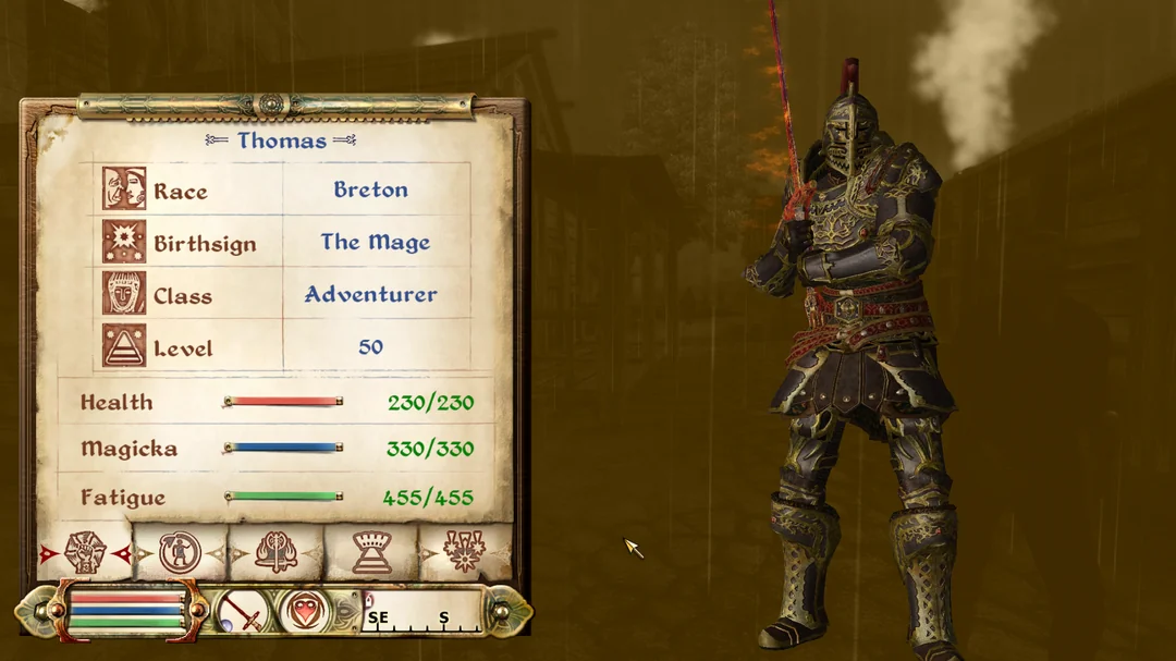
Visual Inspiration
The visual inspiration comes from popular RPG titles with extensive inventories. The pros and cons of each will serve as a starting point for my iterations, while retaining as much of Starfield’s art direction as possible.
Initial Design Iterations
I made three separate mock-ups of the initial inventory screen with various layouts.
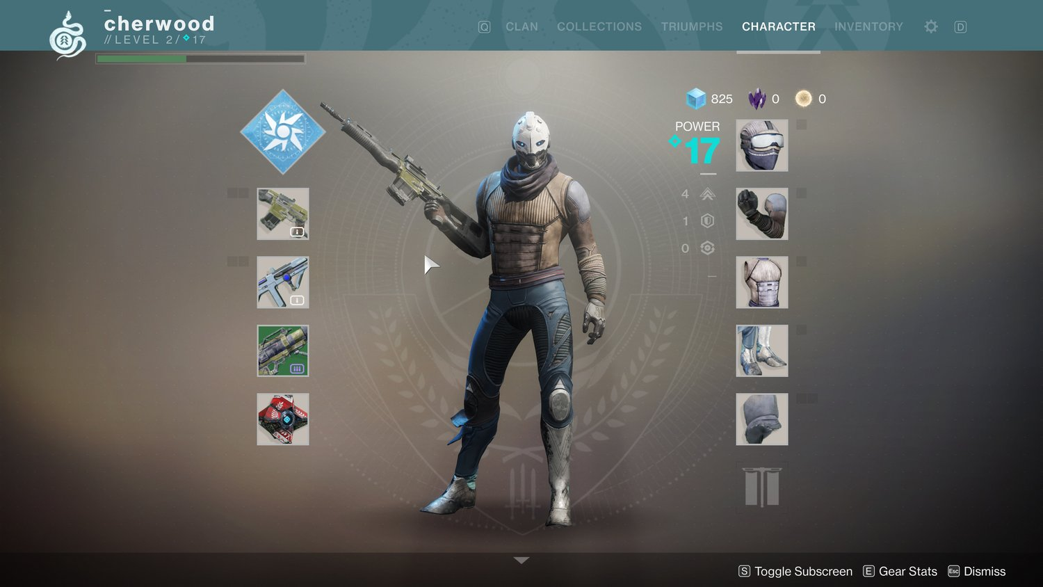
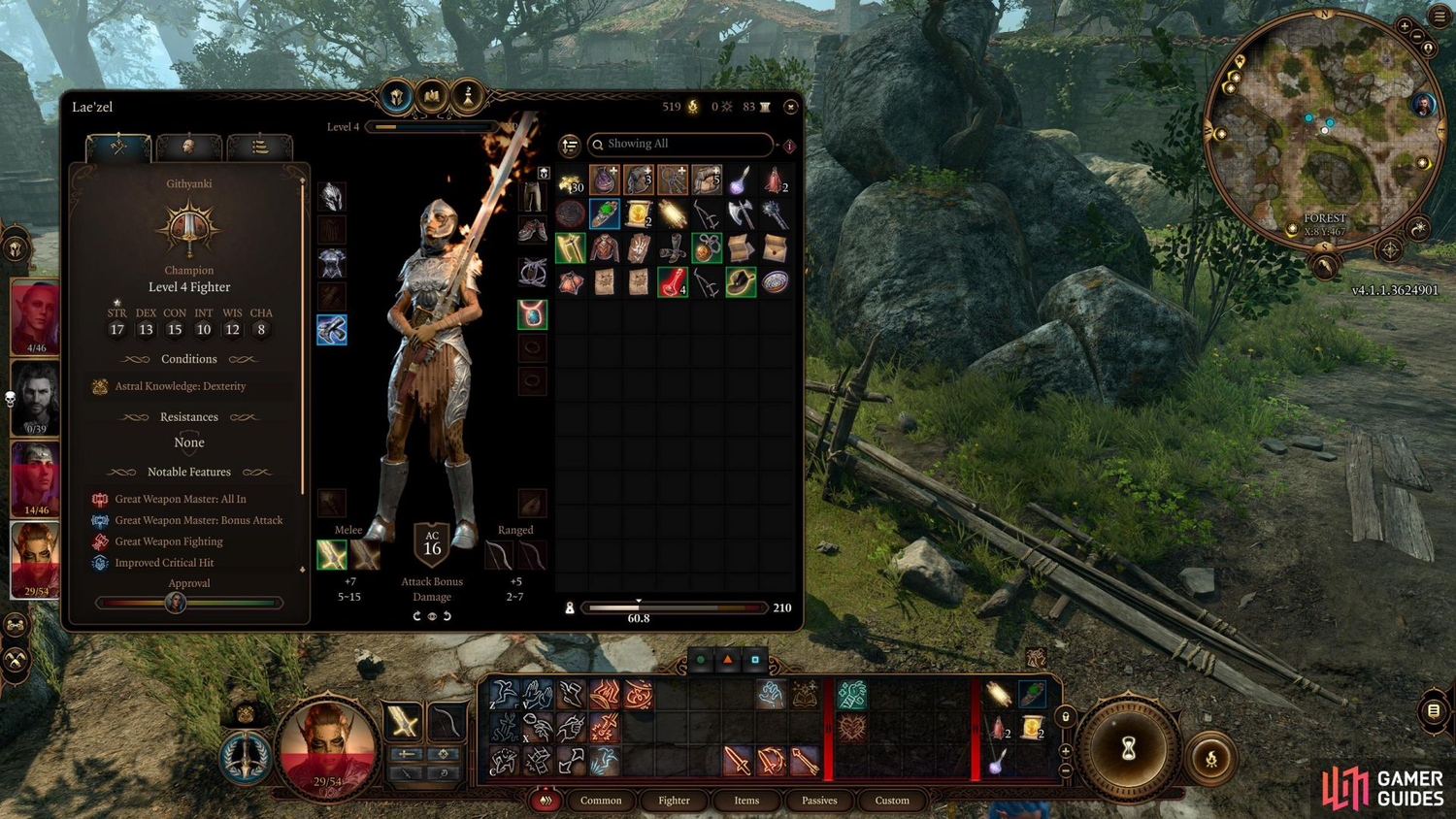
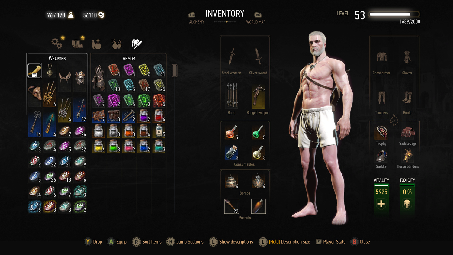
Inspired by The Witcher, Destiny, and Baldur's Gate 3
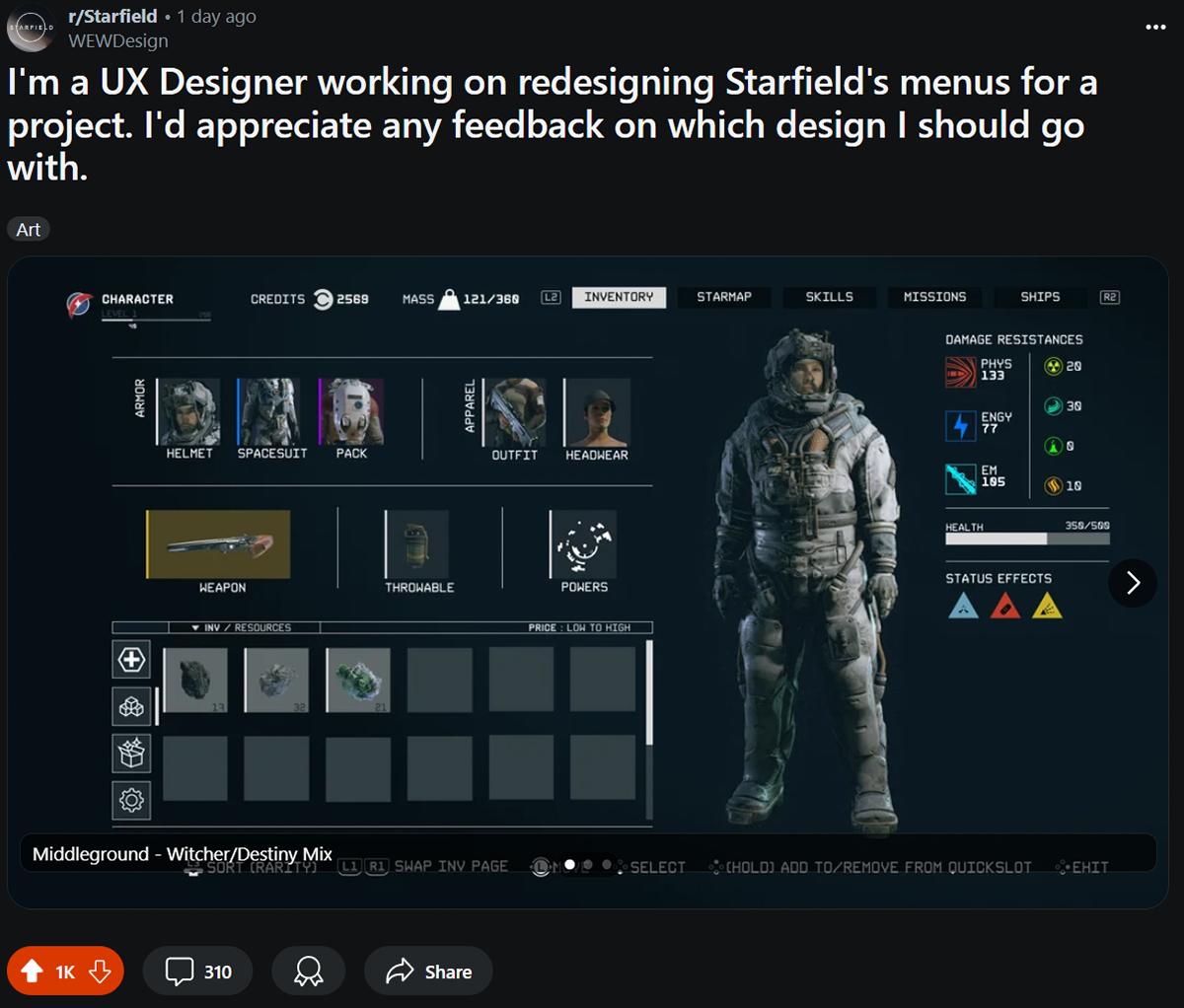
"Middleground" - Witcher/Destiny Mix
"Minimalist" - Destiny Inspired
"Full Functionality" - Witcher/BG3 Inspired
Community Feedback
I presented all three mock-ups on the Starfield subreddit, along with explanations of their inspirations, and was immediately flooded with a few hundred comments of feedback.
The takeaways from my designs were the following:
“Middleground” and “Full Functionality” proved to be the most popular because they appeared management-focused. However, the layouts also felt cluttered.
“Minimalist” liked the clean look and layout, as well as its intuitive nature.
People preferred data readouts of their items over icon or slot representations.
There’s a small minority who prefer Starfield’s stock/vanilla UI with its singular list style
After hearing the feedback on the initial designs, I decided to rethink my approach to inventory management and focus on improving the usability rather than changing the aesthetics.

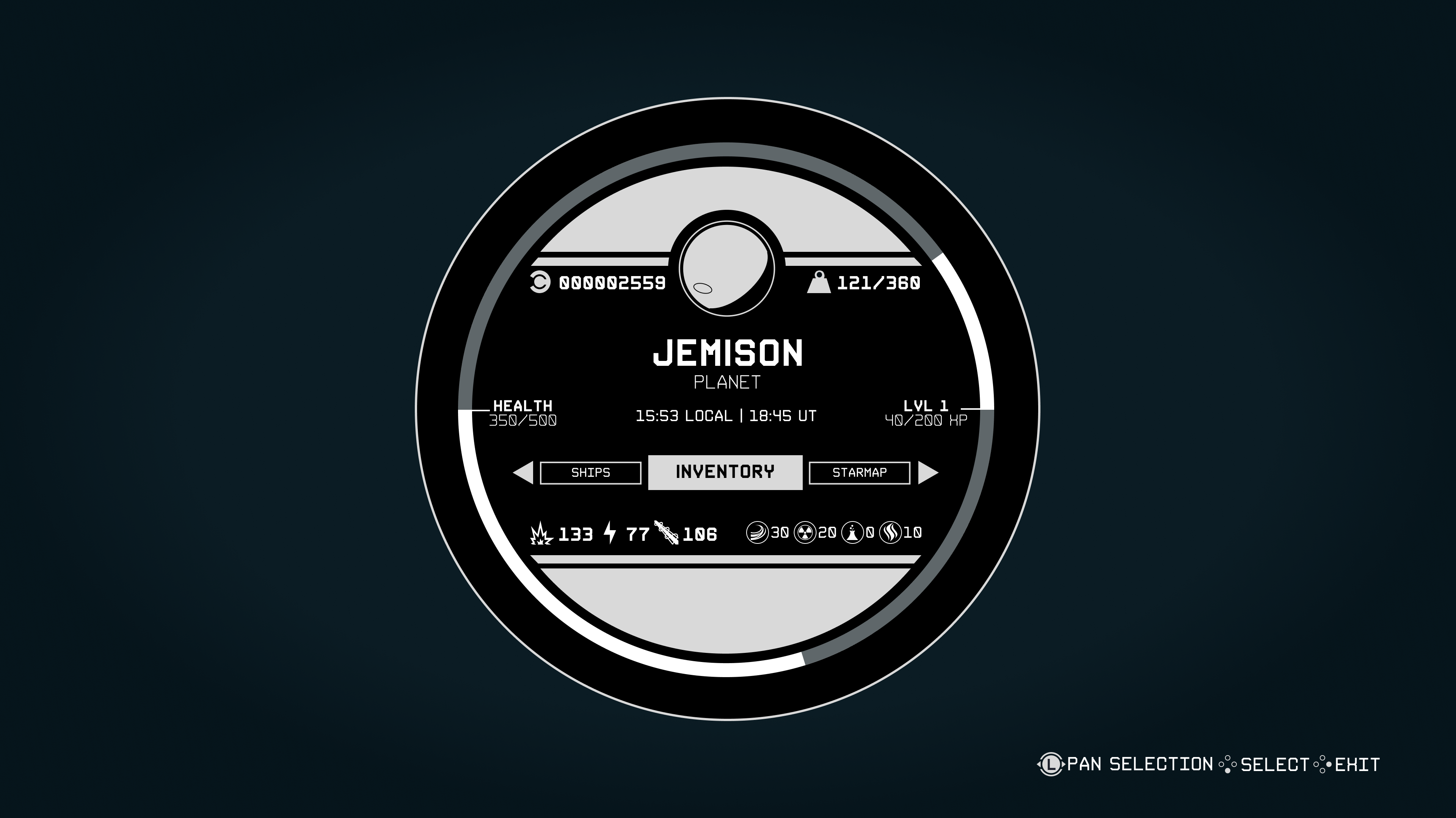
Menu Landing Screen
The landing screen has been completely changed to fit with the in-game Constellation watch-face design seen on the main HUD. It provides basic character information, including general stats and current location. The overall pause menu is navigable through a menu carousel to additional pages.
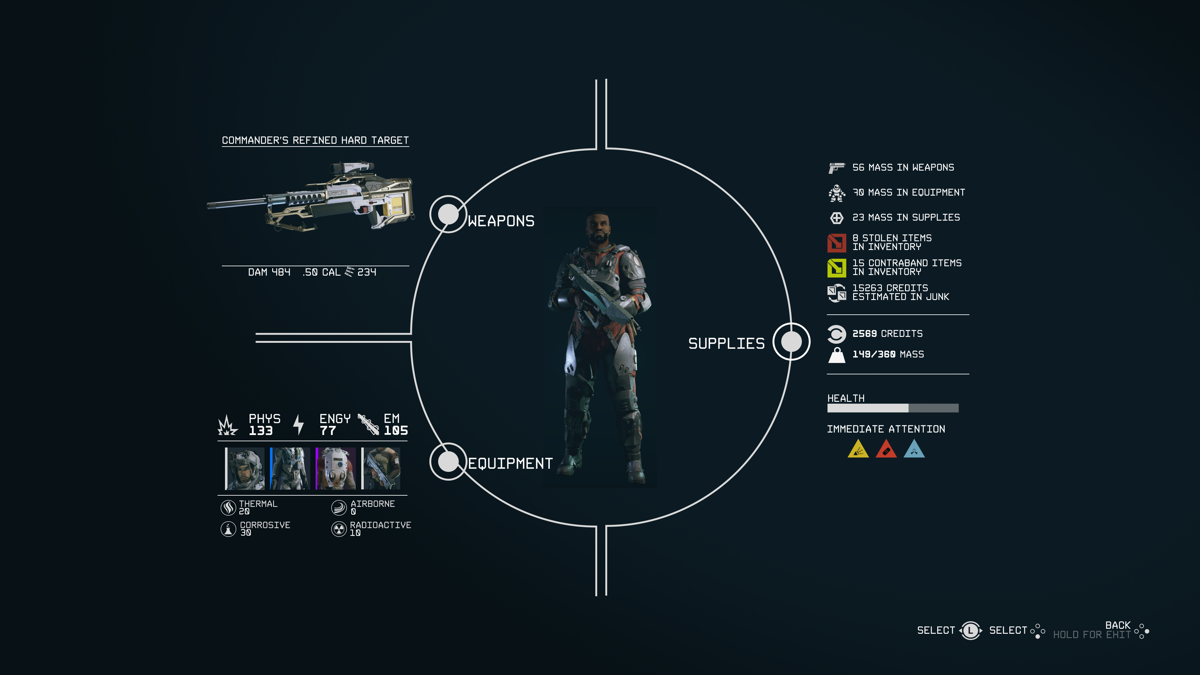
Inventory Sub menu
The landing page for the inventory sub-menu is similarly designed to the base game menu interface. Each section of the navigation provides a readout of any equipped items or statuses relevant to that section, aiming to offer detailed yet general information on current stats from each category upfront, so players can immediately progress to where they need to go.
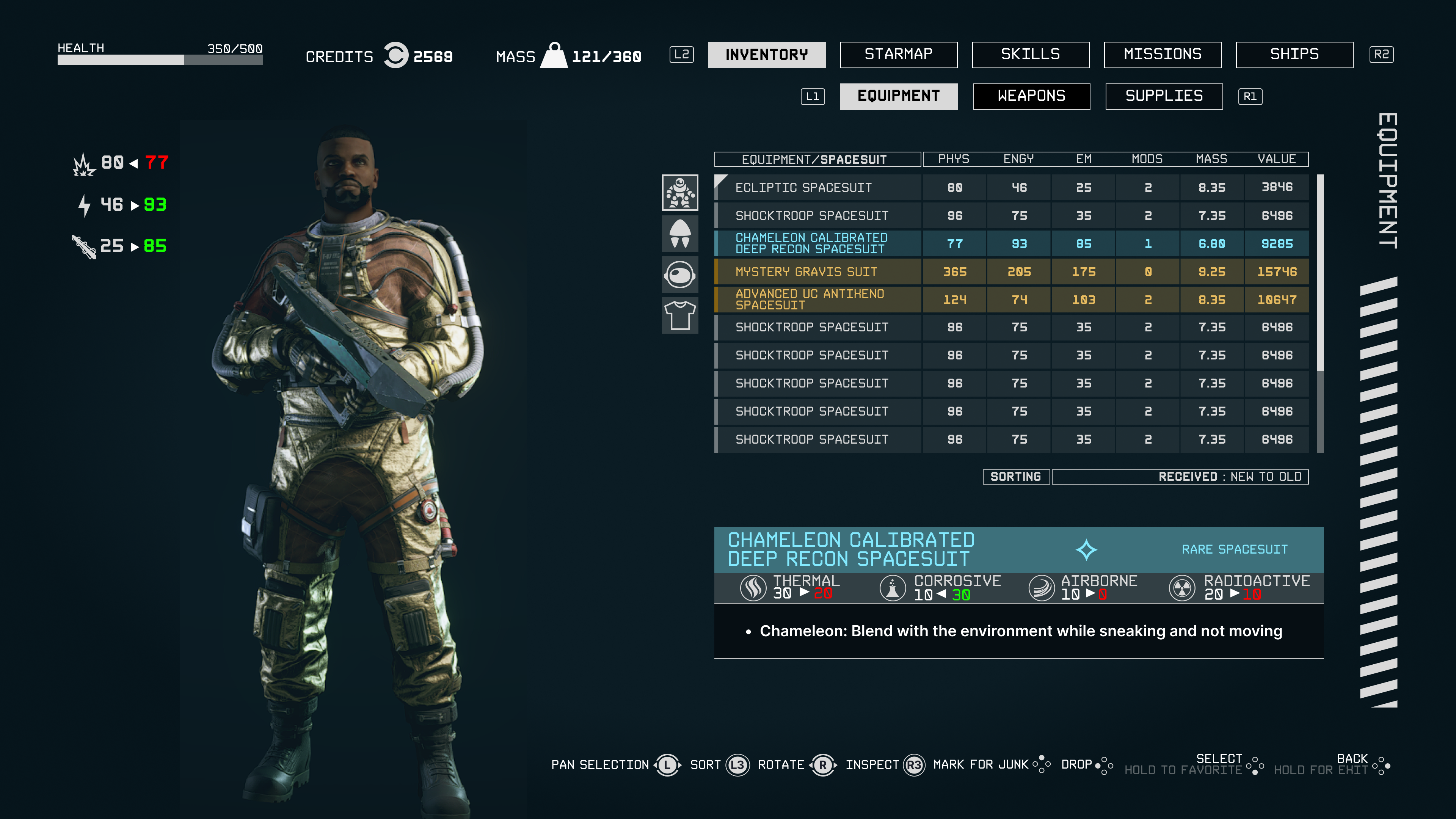
Deeper within the category pages, all items in the inventory are provided with more detailed readouts and organized into even more subcategories. This allows players to navigate by item type and reorganize by statistics.


In formulating what I wanted out of Starfield’s UI versus what people wanted, I’ve learned that designs are INCREDIBLY subjective in fanbases. Finding a middle ground that balances simplicity, clear item information, and effective inventory management seemed to be a drastically challenging task. When I reposted my new iterations to the subreddit, I was met with a different set of opinions than the ones I initially received, which raised questions about whether I had been successful.
The endgame is usability and design with the user in mind. However, the diversity of needs among players makes this more challenging. Perhaps ignoring most of the wants and focusing solely on the needs is the only recourse. My takeaway is that this is all subjective, and without hands-on testing, rather than the polling that I’ve done thus far on Reddit, the process is only marginally helpful in practice.